
 In response to some requests from commenters I’ve put together a few more graphs of how draft picks tend to pan out according to when they were picked. These graphs are for all players and not broken out by position. Mostly it’s just some food for thought heading into the big day tomorrow.
As always the data are from Pro-Football-Reference.com. All draft picks from 1996-2008 are considered.
First is a graph of the likelihood of Pro Bowl selection according to draft order (overall pick number). The graph is grouped into sets of five picks, with the first data point as picks #1 to #5, the second as #6 to #10, etc. Without the grouping the graphs are too noisy to be helpful.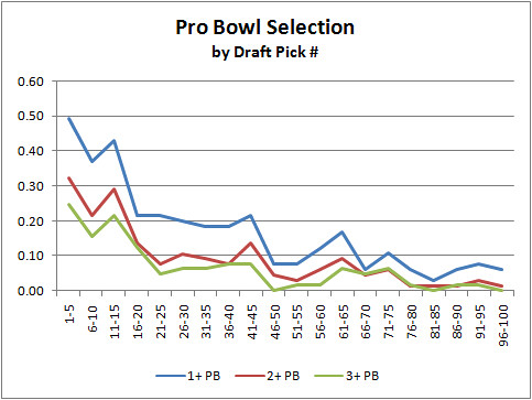
Notice the small spike for picks #11 - 15. I'm not sure if we can read anything into that or not, but it might be worth investigating.
Next is a graph of the average years as a starter by draft order. The picks are grouped into sets of 5.
Phil B. raised an important consideration. Player success has a lot to do with opportunity, and that needs to be factored into the discussion. He suggested that top picks will get the opportunities to start, (ostensibly because teams have the most invested in them). So regardless of differences in ability, top picks would naturally be expected to become Pro Bowlers more often simply due to opportunity. Phil suggested a graph plotting success divided by opportunity.
I think this graph is what he was suggesting. Below is a plot of number of Pro Bowl selections divided by years as starter (#PBs/St Yrs), by draft order.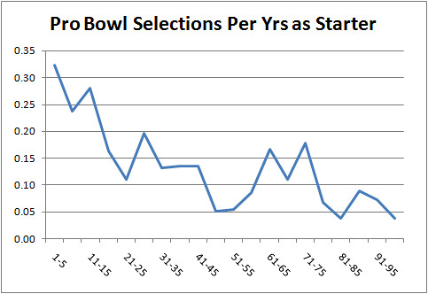
There is a distinct downward slope. The top picks are more likely to become successful even accounting for opportunity (at least in terms of Pro Bowls, an admittedly imperfect measure). In fact, my hunch is that this would over-account for opportunity because Pro Bowl selection and being a starter are both directly proportional to player talent. So we’re really dividing talent by talent + opportunity. The “excess” Pro Bowl selections of the top picks suggests their success has to do with more than just opportunity. But it might not be all due to talent--top picks certainly get their share of notoriety, which can be a factor in Pro Bowl selection.
Notice the plateau from about pick 51 to pick 80. I'm not sure if it means anything, but perhaps this suggests 3rd round picks are better in terms of talent than their opportunities allow. Or on the other side of the coin, maybe 2nd round picks are given more opportunities than their talent merits. But it might be just noise in the data.
A quick note regarding the use of Pro Bowl selections as a measure of success. I've pointed to the flaws in using Pro Bowl selections several times, so perhaps I should explain why I do think it can be useful. Even though Pro Bowls aren't purely performance-based, the best players do rise to the top in the aggregate. Plus, being named to at least a single Pro Bowl at some point in a player's career, at the very least, confirms a pick is not a bust.
Career Success by Draft Order

Draft Picks: Bricklayers or Gladiators?
 With the draft upon us, there is a lot of chatter about ballooning rookie salaries for top picks. The consensus seems to be that top picks are not worth the cost and salaries should be capped. But there’s a good reason why the top players’ salaries are so high, and the explanation can be found in economic ‘tournament theory.’ A short example by economics professor Robert Schenk explains it nicely:
Say you’re a contractor and your company builds brick walls. Most of your bricklayers lay about 3 bricks per minute and make about $8 per hour. (You can think of this as the replacement level.) But along comes a guy who lays bricks twice as fast--6 bricks per minute. How much would you be willing to pay him? Simple fairness suggests $16 per hour. Certainly no more than that because you could just replace him by hiring two replacement-level guys and get the same production. So in this example rewards are based on absolute differences in productivity. Large differences in productivity result in large differences in rewards. Similarly, small differences in bricklaying ability would result in small differences in hourly pay.
 Now consider two ancient gladiators entertaining the emperor in combat. Even if one gladiator is only slightly better than the other, he’ll very likely win, and the differences in rewards could be extreme. Here, in a winner-take-all system, absolute differences in ability do not matter, only relative differences.
What about sports like football? First, in many ways the NFL is a winner-take-all system. Whoever wins the game earns 100% of the win while the loser eats all of the loss, and there is only one champion left standing at the end of the season.
Second, football players are not like bricklayers. You cannot replace an All-Pro QB by sending two average QBs out on the field and expect the same productivity. When there is a constraint on the number of people that can be employed at one time, the value of the most productive people rapidly increases.
And when there is a constraint on the number of contributors combined with a winner-take-all reward structure, the value of the top performers will skyrocket. This is why the top NFL draft picks make so much more than the lower picks. Even if the abilities of the top picks are only marginally better than those of the picks in later rounds, there will be very large differences in pay.
It’s not much different than CEO compensation. If a company is in competition with other companies for market share, the shareholders should want the best CEO they can get--especially because a competitor with a slightly more visionary CEO will likely steal market share, even if your guy is still top-notch. And since you can’t replace a single chief executive with two average guys or a whole mob of slackers, the CEO’s pay is going to end up being wildly disproportionate to his actual ability. There can be only one guy at the top, only one winner of the tournament.
Note that I’m not claming that rookie salaries should be this high, just trying to understand why they’re so high. And I’m not comparing rookie pay to veteran pay. That’s another topic for another day.
"Must-Win" Games
 “This is a must-win game…” Well, unless one team has a 3 wins already no game in a 7-game MLB, NBA, or NHL series is technically ‘must win.’ But certainly some games are more crucial than others in terms of a team’s chances of winning the series.
For example, the Rangers currently have a 2-0 advantage over the Capitals in the first round of the NHL playoffs. The difference in Series Win Probability (SWP) between being down 0-3 and down 1-2 tells us exactly how critical this Game 3 is. Based on a symmetric binomial distribution (that is, a coin flip--each team has an equal chance of winning each game), the SWP of being down 0-3 is 0.0625 and the SWP of being down 1-2 is 0.3125. The potential change in SWP (∆SWP) for Game 3 is 0.25.
The difference in SWP for Game 2 however was larger. The SWP(1-1) is 0.5. And the SWP(0-2) is 0.1875. The ∆SWP for Game 2 was 0.3125. Game 2 therefore had more leverage than Game 3 will. It was about 20% more crucial (.31 vs .25).
Continuing on this path, the ∆SWP for all Game 1s is SWP(1-0) vs SWP (0-1) which is also 0.3125. So both Game 1 and Game 2 were both more critical than Game 3. But this is only because the situation of being 0-2 is already fairly dire.
Ironically, the must win situation of 0-3 yields a ∆SWP of only 0.125. Again, this is because 0-3 is very dire. A team is pretty close to elimination anyway. Winning Game 4 when down 0-3 still only buys a team a .125 chance of winning the series while losing the game would make it zero.
The most critical situation is Game 7 of a 3-3 series . The 3-3 situation features a ∆SWP of 1.0—the winner goes from 0.5 probability to 1.0 (certainty) in a single game, while the loser goes to zero.
The next most critical games are Game 6 of a 3-2 series and Game 5 of a 2-2 series. All Game 6s are 3-2 and yield either a 4-2 (1.0) or 3-3 (0.5) result for a difference of 0.5. Game 5 of a 2-2 series is just as critical. Being up 3-2 yields a SWP of 0.75, while (symmetrically) being down 2-3 yields a SWP of 0.25, the difference being 0.5.
Here is the full table:Game Situation Leverage Game 1 0-0 0.3125 Game 2 1-0 0.3125 Game 3 2-0 0.25 1-1 0.375 Game 4 3-0 0.125 2-1 0.375 Game 5 3-1 0.25 2-2 0.5 Game 6 3-2 0.5 Game 7 3-3 1
Notes:
1. This method ignores home ice/court/field.
2. It also assumes teams are evenly matched. Empirical observations of teams that comeback from 0-3 deficits will be less frequent than predicted by the theoretical average because teams down 0-3 tend not to be evenly matched. I think a symmetric binomial model (coin flip) is sufficient because we're looking at the 'typical' leverage for the various series situations and not necessarily for particular match-ups.
3. You can also use this table for 5-game series. A 5-game series is no different from a 7-game series that starts tied at 1-1. To find the leverage of a game in a 5-game series, take the current record and add 1 win for each team. For example, the leverage for a 5-game series that's at 2-1 is identical to that of a 7-game series that's 3-2 (0.5).
Drafting Linebackers
 In some circles, the conventional wisdom is that great linebackers can be found anywhere in the draft, and that teams should think twice before taking a LB in the first round. This post will take a look at whether this is true by looking at LB performance according to draft round and pick order.
We've seen how performance varies by draft position in QBs, RBs, DEs, WRs, and DBs. How do LBs compare? Based on the careers of all LBs taken in the 1980 through 2001 NFL drafts, we'll see how scarce top LBs typically are, and what kind of performance teams can expect from their picks.
I'll start by looking at Pro Bowl selections, and I'll repeat my standard disclaimer. Pro Bowl selection is a very imperfect measure of a player's value for a lot of different reasons, but it does identify the top players at each position which is what much of the draft is about. One other advantage it offers is that player value can be compared across positions. For example, we can compare LB draft picks to QB draft picks using Pro Bowl selections, but using passing yards or tackles wouldn't work to well.
The first graph looks at the rate of Pro Bowl selection by draft round. The blue line illustrates the likelihood a pick from each round will be selected to at least one Pro Bowl at some point in his career. The red line is for two or more Pro Bowls, and the green line is for three or more.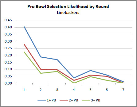
The next graph looks at Pro Bowl selections by draft order within position. The scouts must be doing their job because first linebacker taken really outshines the second, third, etc, at least in terms of going to at least one Pro Bowl.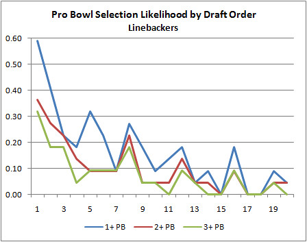
The third graph is the average number of years a player is a starter for his team, broken out by draft order. The careers of the first LBs taken appear to have more longevity.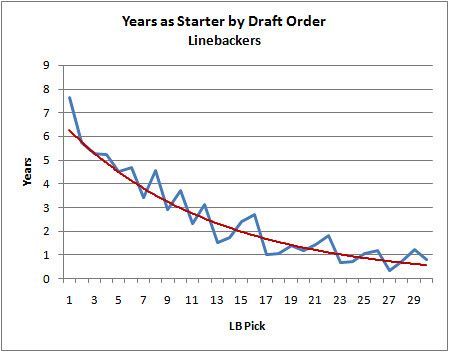
The graphs remind me a lot of the ones for wide receivers. There is a relatively large drop off after the very top players taken.
The continuing theme in this series is that the best players really do come from the top of the draft. No surprise there. But the top players have more than just an incrementally higher chance of great success, but double or triple the chance. The scouts and GMs do have an ability to recognize the players with the most potential at every position we've looked at so far. It's interesting to see just how steep the drop off really is after the first few players.
Drafting Defensive Backs
 Continuing the series of analyzing the NFL draft by position from last year, this post will look at defensive backs. How likely do the top picks outperform the later ones? How often do later picks turn out to be solid contributors? How do they compare to other positions? Using data from all defensive backs taken from 1980 through 2001 I'll answer those questions.
Unfortunately, the draft data at Pro-Football-Reference.com does not distinguish between cornerbacks and safeties (for understandable reasons). They are all considered defensive backs, so this analysis will have to do the same.
First, let's look at Pro Bowl selections. As I've mentioned before, Pro Bowl selection is a very limited measure of a player's value. In fact, no single measure can be perfect. But Pro Bowl selection does tend to signify the top players at their positions, and that's really what much of the draft about.
The graph below illustrates the likelihood of a defensive back taken in each round to be named to 1 or more, 2 or more, and 3 or more Pro Bowls in his career. As you'd expect, there is a steep drop off after the first round.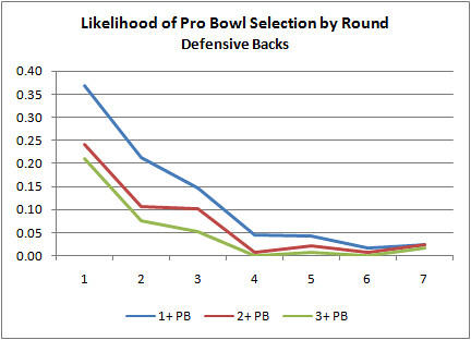
The next graph illustrates the same thing, but by draft order--in other words, regardless of round or overall pick number, was the player the 1st, 2nd, 3rd and so on defensive back taken? After the top couple DBs taken each year, there's a steep drop off in the chances the player will turn out to be a star.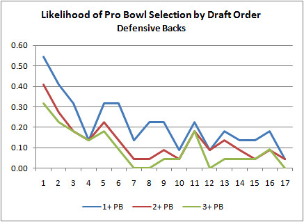
Notice anything about the shape of the distributions? They're power law probability distributions, the signatures of many natural complex systems with all the implications that come with them. The next graph isolates just the '2 or more' Pro Bowls likelihoods and fits a power law curve.
Next is a graph of years as a starter by draft position. No, this time it's not a power law distribution but an exponential one, which is a little easier to interpret. Every subsequent DB taken will have an average career as a starter 7.9% shorter than the earlier DB taken. There may not be many stars in the later picks, but there are plenty of durable starter-quality players to be had.
Although it's not the only measure of a DB by a long shot, we still want them to intercept passes as often as possible. The next graph looks at the total number of interceptions by draft order. Just like the years as starter graph, the curve is exponential with an average 7.4% difference in total interceptions from any given DB pick to the subsequent pick. I'm not sure this tells us anything more than the last graph of years as starter. The two graphs closely mimic each other for obvious reasons.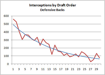
The last graph we'll look at is the likelihood the a DB draft pick will turn out better than the subsequent DB chosen. To define 'better' I used years as a starter rather than any of the other measures. All the measures are flawed, but I think years as a primary starter is the safest measure because it captures so much other information, both quantitative and qualitative, about a player's performance.
This graph will tell us how well scouts and personnel executives identify the better prospects. But looking at DBs in isolation doesn't tell us much, so I added RBs and QBs to the graph for comparison.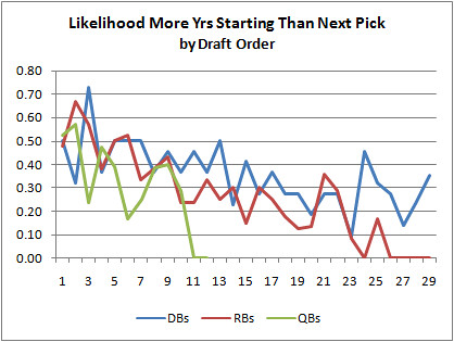
All three positions are fairly noisy, but it looks like scouts can identify the superior DBs slightly better than RBs and QBs, particularly deeper in the draft. What this means is that GMs can have slightly better confidence when picking a DB than the other selected positions. We should expect an inverse relationship between the ability of scouts to identify the superior prospects and how deep into the draft teams can expect to find solid starter-quality players.
And that's really the point of all this analysis. In order to eventually build a sound comprehensive model of draft strategy, we'd need to know all of the likelihoods of success for the various positions in each round and at each pick order. In the meantime, it's useful to know how deep into the draft a team can find viable contributors at the various positions.
Earthquakes, Kevin Bacon, The Financial Crisis, and Pro Bowl Selections
 Most of the analysis I do at this site is based on the normal distribution (aka Gaussian aka bell curve). Team records, yards per attempt, sack rate, turnovers, and just about everything else follow a bell curve distribution where most teams or players are bunched around the average and a rapidly diminishing number are found at the extremes. Most of the statistical tools used here such as regression, correlation, or even simple averages are based on the assumption of a normal or quasi-normal distribution.
Normal distributions are ubiquitous in sports for mainly two reasons. First, the rules provide level playing fields, fixed boundaries, and predictable cause-effect relationships. Football games always last 60 minutes, the field is always 100 yds long, a touchdown is always 6+ points, and a win is always a win no matter how close the score. Second, there is a significant amount of random luck involved in sports, which by definition is always distributed normally.
Other distributions with different shapes appear in sports. Recently I looked at how sports like soccer, lacrosse, and particularly hockey are better modeled with Poisson distributions.
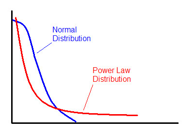
There are other distributions that often appear in nature and in sports that are completely unlike the bell curve most of us are familiar with. The power law distribution is a prime example.
The Power Law
Have you ever noticed how most of the productivity around your office seems to be accomplished by a minority of your co-workers? It’s no different in the NFL, or most anywhere else.
The power law is all around us, and is a fundamental property of natural organizations of all types. City sizes, for example, are distributed according to the power law. There are a few extremely large cities, more average sized cities, and very many smaller towns. Earthquake sizes, the structure of the Internet, stock market gains and losses, body mass indexes, gravity, social network connections, wealth distributions, and even Kevin Bacon movies all follow power law distributions. If you've ever heard people refer to the "fat tail" or the "long tail," this is what they're referring to.
The power law distribution follows this equation:
where x and y are variables and a and b are constants. The constant b is known as the scaling exponent.
 The Financial Crisis
Our current financial crisis was in part caused by a fundamentally wrong assumption about risk distributions in the debt markets. An oversimplified explanation is that investment companies made lucrative but risky investments, and then hedged against their failure by buying insurance in the form of complex derivatives in case they went bust. These companies thought that they had cracked the code and solved the problem of risk once and for all. (One of the reasons the company AIG is central to the problem is that it's the company that led the selling of all that insurance.)
The problem was that the insurance was priced based on an assumption of bell curve distributions of market risk. A model known as the Correlated Gaussian Copula was developed by a Chinese mathematician named Li, and it was widely used throughout the financial industry for measuring and pricing risk. Unfortunately, financial markets act more like earthquakes than normally distributed phenomena like rainfall or human height. There are lots of minor fluctuations but occasionally the bottom drops out. The power law distribution has a ‘fatter tail’ at the extremes than the normal distribution, meaning extreme outcomes are considerably more likely.
Network Organization
One reason we see power law distributions so often is because they are a signature of networks. The picture below could represent a computer network, a social network, highways between cities, or airline routes. But let’s say it represents business connections among individuals. If you’re an entrant into that business market and had the resources to afford to establish a single link, who would you prefer to hitch your wagon to?
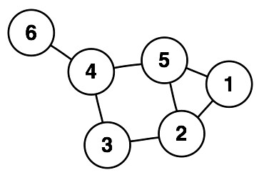 I’d want to be associated with someone who is already well-connected. I’d want to connect to #4 or #5. Each already has 3 connections and is no more than 2 degrees removed from any other member of the community. I’d avoid #1 and especially #6. They have fewer connections and are further removed from the rest of the group.
This process tends to enrich nodes that already have a large number of links. Once the decision is made to link to either #4 or #5, that node would now be even more attractive to subsequent entrants. In organizations like this, the number of links for each node follows the power law distribution.
Scale Invariance
The fundamental feature of power law distributions is ‘scale invariance.’ For example, if you count cities of a certain size, cities half has large might be four times more common, and cities twice as large might be four times less common. If this pattern holds throughout the full range of cities, then you have scale invariance. This relationship means there is no typical city size. There will still be an arithmetic mean, but it won’t actually be the ‘average’ the way we understand it. There really is no average.
Success in College Football
What does any of this have to do with football? First, compare the NFL with college football. Think of the teams as strongly-linked clusters of individual players and coaches in the network of the overall league. The teams themselves are in turn linked and clustered by division or conference.
In college ball, elite players choose their team largely on their own, and it’s no surprise that they select their team based on the team’s current strength and the prominence of the coach. Players who aren’t recruited by the USCs and LSUs of the world will still prefer PAC 10 or SEC teams. And failing that, they’ll prefer any Division IA (or “Bowl Series”) school to the lower divisions and conferences.
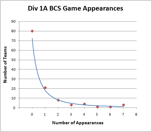
The NFL is constructed differently. With the salary cap and the draft, the better players are distributed more evenly throughout the league. Its distribution of championship appearances is decidedly not a power law distribution. But BCS appearances by college teams certainly is:
Pro Bowl Selections
What does follow a power law distribution in the NFL is Pro Bowl appearances. Just like in your office where a minority of employees can account for most of the productivity, the talent in the NFL is distributed in a similar way. In doing my analysis for drafting defensive backs I noticed just how much Pro Bowl selections were concentrated among the top players.
Among all the defensive backs drafted from 1980 through 2001 who have had at least one year as their team’s primary starter, the distribution looks like this:

There are plenty of players with no appearances, a smaller group with 1 selection, and then a steadily decreasing number of players with 2, 3, 4, etc. selections. As you can see, the distribution approximates a typical power law distribution.
Here is the distribution for QB Pro Bowl selections. It approximates a power law distribution even better.
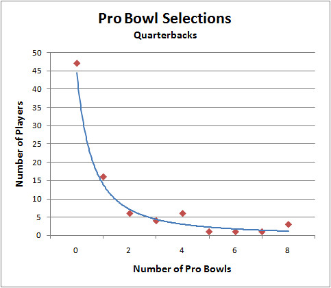
What does this tell us about Pro Bowl selections? Does this mean that being chosen for the Pro Bowl is based on how connected a player is? Partly--because the votes of other players and coaches weigh heavily in the selections, but that’s not what I’m getting at. Besides raw performance, it also depends on how popular the player is, how good the rest of his team is, how often the team plays on national TV, and how good he was in previous years. And all those things are correlated with each other--it's a complex self-organizing system of factors and influences. That’s one reason why we see the power law at work here.
Coaching Tenure
Another example of the power law in football is the tenure of coaches. This paper from the UK found that coaching tenure in the Premier League follows a power law very closely. They even looked at NFL coaching tenure and found the same pattern. I’ve done my own analysis and confirmed that coaching tenures in NFL obey the power law distribution. What the researchers conclude is that talent and ability has relatively little to do with how long a coach hangs on to his job. It mostly has to do with being ‘sacked’ or ‘poached,’ and with the random luck of his team. (For instance, Jon Gruden was poached from Oakland and sacked at Tampa Bay). Interestingly, the tenure of leaders of many kinds including Popes, British Prime Ministers, and Roman Emperors follow power law distributions.
Player Tenure
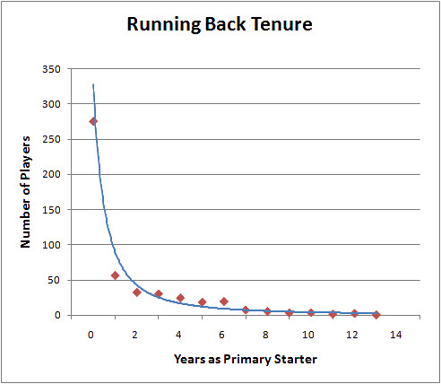
Although career length does not follow a power law distribution, years as a starter does. For example, of all the RBs drafted between 1980 and 2000, the majority will never be a starter, and the rest of the players have steadily decreasing chances of lasting long as a starter. Here is the distribution:
Why Any of This Matters
Power law distributions are noteworthy because they are the signatures of mature self-organizing complex systems. It’s also a feature of ‘rich-get-richer’ systems. So when we see power law distributions, we can make some qualitative inferences about the system we’re observing. For example, the BCS system is certainly a rich-get-richer organization. We can even quantify just how hierarchical it is and how difficult it is for second-tier teams to break into the elite.
The problem with the BCS isn’t just that it’s a rich-get-richer system. That’s just the natural way of the world. Even in supposedly ‘egalitarian’ systems like socialism, the rich still get richer. The difference is that initial outcomes in socialist systems are based primarily on one’s political connections, where in a free market they tend to be based on how productive or innovative one is. The problem is that the elite ‘nodes’ of the BCS have colluded to preserve their status on top, preventing a natural churn in who the elite are.
Understanding the implications of power law distributions also helps make more accurate models. For example, there really isn’t an average coaching tenure, and the standard deviation of tenure is not a meaningful statistic. Instead of applying the normal distribution and its associated analytical tools to everything we see, we should be more cautious.
If anyone is interested further in network theory and power law distributions, I recommend the book Nexus: Small Worlds and the Groundbreaking Theory of Networks. Regarding the current financial crisis and the misapplication of risk models, I recommend this prophetic 2005 WSJ article.
NBA Playoff Win Probabilities
 Live win probabilities for NBA playoff games are available at wp.advancednflstats.com/nba. Previous final games are here. The WP graphs include new features and stats. Some of the recent additions include:
Possession Value (PV): The value in WP of simply having the ball. Defined as the ‘next expected’ outcome of a possession, usually 20 sec off the clock, 10% chance of a 3-point gain, 35% chance of a 2-point gain, and a 10% of a 1-point gain.
Leverage Index (LI): A ratio of the current Poss Val to the an NBA game’s typical possession value, which is 0.04. So when the Poss Val might be 0.10 toward the end of a close game, the LI is 2.5.
Comeback Factor (CF): A measure of how big a comeback the game comprises. Based on the current winning team’s lowest WP at any point in the game. Adjusted to a scale of 1-100. Technically defined as 1/(lowest WP). For example, a team that has come back from a 0.10 WP to lead or win a game has a CF of 1/0.10 = 10. An epic comeback from a 0.01 WP would be 1/0.01 = 100.
Excitement Index (EI): (I need a better name for this.) Based on the net average deviation of the game’s WP from 0.50. A blow-out where one team takes the WP to 0.99 or 0.01 for most of the game will have a large deviation (boring). A game that teeters around 0.50 WP will have a small deviation (exciting). A game where the advantage swings wildly back and forth between teams (also exciting) will also have a small net deviation of 0.50 because the large swings cancel out.
One of the reasons I'm tinkering with the NBA win probability now is as a dress rehearsal for the upcoming NFL season. I'm working on analogous features and stats for NFL games. By the start of the NFL season I should have a pretty comprehensive WP site. Toward the end of last season, there was a healthy discussion on how to measure the 'excitement' value of a game. I think I've got a good foothold now on how to do that.
Here's a sample of what the NBA graph looks like right now. This is from a final game, a live game will have some added stuff.
If anyone is interested in the inner workings of the basketball WP model, you can check my post at the Wages of Wins blog. As always, comments and suggestions are appreciated.
Draft Analysis by Position
 It’s draft season again, and one of the most important aspects of draft strategy is assessing the value of players taken at the various spots throughout the draft. How well to 1st round QBs pan out compared to 2nd or 3rd rounders? How sure can a team be that the 1st QB taken will in fact turn out better than the 2nd QB taken? Can a team really find good RBs in the 3rd round compared to the 1st? Do some positions tend to be gambles compared to others which may tend to be sure things?
The purpose of this analysis is to quantify the scarcity of quality players in the various positions and the ability of scouts to actually identify who the better players are going to be. Knowing these things, teams can construct better draft strategies. For example, if the better RBs actually come from the first few taken each year and generally can’t be found in the later rounds, then teams looking for a RB need to plan accordingly. Additionally, if it’s found that top RB draft picks tend to be ‘sure things’ compared to other positions, then teams may prefer to fill other needs with ‘known-quantity’ veterans rather than relatively uncertain draft picks.
Last year I looked at most of the skill positions because they tend to be the focus of the most attention and they provide easier measures of performance with their stats. My analysis of each position usually follows a similar pattern.
I looked at how likely players taken in the various rounds would attend one, two, or three or more Pro Bowls. Although Pro Bowls are an imperfect measure of a player for several reasons, they do signal a player’s overall achievement in ways that individual performance stats cannot capture. Pro Bowl appearances also indicate whether a player was a ‘home run,’ something GMs are certainly looking for in the early rounds.
I also looked at other indications of a successful draft pick, such as numbers of years in the league and number of years as a team’s primary starter. Although a player may never make a Pro Bowl, he may still be a solid above average player, and that’s certainly of great value to the team who drafts him.
For positions like QB or RB that offer obvious performance measures such as yards per attempt (or even DE with sacks per game), it’s very helpful to look at those distributions too. Plus, a good measure of how well scouts can predict the better prospect is the likelihood that an earlier pick will actually turn out better than the subsequent pick at the same position.
Each one of these measures is imperfect for measuring the value of a draft pick in some way, but together they give us a very good idea of how scarce the various positions really are and how well scouts identify the better players.
One more thing I’ll point out is that draft round doesn’t tell the whole story. It’s also important to look at the overall order a player was taken within his position. In other words, not all first round picks are the same. If 3 QBs were taken in the first round, they’re going to have very different likelihoods of becoming a top passer.
I’ll recycle the positions I analyzed last year, partly because there are so many new readers this off-season compared to last:
QBs Part 1
QBs Part 2
RBs
WRs
DEs
Next, I’ll be looking at defensive backs, but I’ll also tie in an interesting observation about how career success is distributed among NFL players. And if anyone is waiting for part 2 of the Passing Predictability article, I’m going to put that on hold until after the draft.
Lastly, I’ll mention that most data comes from Pro-Football-Reference.com’s draft database, which is complete with great career data and features a great query tool.