- Home Posts filed under modeling
Simulating the Saints-Falcons Endgame
I previously examined intentional touchdown scenarios, but only considered situations when the offense was within 3 points. In this case NO needed a TD, which--needless to say--makes a big difference. Yet, because NO was on the 1, perhaps the go-ahead score was so likely that ATL would be better off down 3 with the ball than up 4 backed-up against their goal line.
This is a really, really hard analysis. There's a lot of what-ifs: What if NO scores on 1st down anyway? What if they don't score on 1st but on 2nd down? On 3rd down? On 4th down? Or what if they throw the ball? What if they stop the clock somehow, or commit a penalty? How likely is a turnover on each successive down? You can see that the situation quickly becomes an almost intractable problem without excessive assumptions.
That's where the WOPR comes in. The WOPR is the new game simulation model created this past off-season, designed and calibrated specifically for in-game analytics. It simulates a game from any starting point, play by play, yard by yard, and second by second. Play outcomes are randomly drawn from empirical distributions of actual plays that occurred in similar circumstances.
If you're not familiar with how simulation models work, you're probably wondering So what? Dude, I can put my Madden on auto-play and do the same thing. Who cares who wins a dumb make-believe game?
What I'm Working On
It's been almost 6 years since I introduced the win probability model. It's been useful, to say the least. But it's also been a prisoner of the decisions I made back in 2008, long before I realized just how much it could help analyze the game. Imagine a building that serves its purpose adequately, but came to be as the result of many unplanned additions and modifications. That's essentially the current WP model, an ungainly algorithm with layers upon layers of features added on top of the original fit. It works, but it's more complicated than it needs to be, which makes upkeep a big problem.
Despite last season's improvements, it's long past time for an overhaul. Adding the new overtime rules, team strength adjustments, and coin flip considerations were big steps forward, but ultimately they were just more additions to the house.
The problem is that I'm invested in an architecture that wasn't planned to be used as a decision analysis tool. It must have been in 2007 when I recall some tv announcer say that Brian Billick was 500-1 (or whatever) when the Ravens had a lead of 14 points or more. I immediately thought, isn't that due more to Chris McAllister than Brian Billick? And, by the way, what is the chance a team will win given a certain lead and time remaining? When can I relax when my home team is up by 10 points? 13 points? 17 points?
That was the only purpose behind the original model. It didn't need a lot of precision or features. But soon I realized that if it were improved sufficiently, it could be much more. So I added field position. And then I added better statistical smoothing. And then I added down and distance. Then I added more and more features, but they were always modifications and overlays to the underlying model, all the while being tied to decisions I made years ago when I just wanted to satisfy my curiosity.
So I'm creating an all new model. Here's what it will include:
Defensive Gamblers
The Redskins had several players at the top or near the top of the regular season +WPA rankings for defensive positions, Hall being one of them. But as I mentioned when I introduced defensive +WPA for individual defenders, gamblers--guys who roll the dice to make a play rather than adhere to their responsibilities--are most likely to be rewarded disproportionately. The problem is that +WPA doesn't capture all the instances when a gamble goes bad, only the times when it works out.
We can't (currently) measure a defender's -WPA, the degree to which a his failures affect game outcomes, because play-by-play descriptions never say things like "DeAngelo Hall bit hard on a double-move, Andre Johnson 67-yard reception for a touchdown." So although we can't attribute defensive failures to individual players, we can measure them on a team level.
How Coaches Think: Run Success Rate
Before tools such as EPA and WPA were available, I relied on team efficiency stats to estimate team strength. Yards per pass attempt or per run attempt worked out to be very good estimators of how good a team was, especially if ‘good’ is defined as being likely to win forthcoming games. Efficiency stats had the added benefit of being relatively simple, widely available, and easy to calculate.
Efficiency stats also worked well in regression analysis. In a regression model, it’s best if the predictor variables are independent of each other. In other words, the less each predictor variable correlates with the others, the more valid and reliable the resulting model will be. Passing and running efficiencies in the NFL correlate weakly. Over the past 10 seasons, offensive passing and running efficiencies for each team correlate at 0.09 (where 1 would mean lock-step correlation and 0 would mean complete independence.)
Pre-Season Predictions Are Still Worthless
Last year I started my stint at the NY Times by calling attention to just how bad NFL preseason predictions are. I compared the “advanced” projections for team win totals compiled by a fellow stats website called Football Outsiders to two benchmarks. They had predicted doom and gloom for the Jets last year, and my article was intended to relieve Jets fans of needless worry. As it happened, the Jets made the playoffs and went all the way to the AFC Championship game.
The first benchmark was a mindless 8-win prediction for every team. Let's call this the Constant Median Approximation system, or CoMA for short. This benchmark represents zero knowledge. It’s what you would guess if you had no information at all about any of the NFL teams except that they each play 16 games. Certainly anyone can out-predict a coma patient, right?
Actual vs. Theoretical WP at the World Cup
In response to a few questions on my last post regarding my World Cup win probability (WP) model, here are some actual numbers to chew on. An anonymous commenter pointed us to actual win rates at WhoWins.com (a fun site by the way). I've graphed the actual rates below.
The actual win rates are for 708 games stretching all the way back to 1930. The theoretical WPs based on a Poisson distribution are the solid lines, and the actual rates are the little triangles and squares. Keep in mind these are the WPs for the trailing team.
Measuring Defensive Playmakers
Traditional individual defensive stats don't tell us much. There are tackles, sacks, and turnovers, and that's pretty much it. Recently, I developed "Tackle Factor," a way to make better sense of tackle statistics, at least for the front-seven defenders. It's not perfect, but I think the consensus was that it's a step forward. Still, there's much more that can be done.
Offensive stats are straightforward, but objective defensive stats are problematic. When a running back picks up a 10-yard gain, although other teammates contributed, that's obviously a good play by the ball carrier. And when a running back stumbles at the line for no gain, that's obviously bad. But looking at the same two plays from the other side of the ball is much trickier. A strong safety, say Troy Polamalu, who makes the best play he can by preventing the runner getting past 10 yards, would be be debited for that 10 yard gain. The other four or five defenders who had a chance to make the play sooner, but didn't, aren't mentioned in the play description and wouldn't be docked for the play.
On the other hand, if Polamalu is playing run support, and he reads the play and stuffs the running back at the line, that's certainly to his credit. If only there were a way to credit each defender for plays like this, and at the same time ignore the plays that really should count against his teammates.
New Proposed Overtime Rules
The NFL announced it is considering new overtime rules. The new rules will be considered by the competition committee and, if approved, would be implemented for future playoff games only. I've heard two versions of the proposal, and in this article I'll analyze both.
The version I heard goes like this: the team that loses the coin flip is always guaranteed at least one possession. If the coin-flip winner (which I'll refer to as the 'first team') scores and the second team matches the score, then the game reverts to the sudden death format. If the first team fails to score and the second team does, the second team wins. If the first team scores a field goal, and the second team scores a touchdown, the second team wins.
Expected Points (EP) and Expected Points Added (EPA) Explained
This post will explain the concepts of Expected Points and Expected Points Added. In future posts when I refer to these stats, I'll link here.
Football is a sport of strategy and decision making. But before we can compare the potential risks and rewards of various options, we need to be able to properly measure the value of possible outcomes.
The value of a football play has traditionally been measured in yards gained. Unfortunately, yards is a flawed measure because not all yards are equal. For example, a 4-yard gain on 3rd down and 3 is much more valuable than a 4-yard gain on 3rd and 8. Any measure of success must consider the down and distance situation.
Field position is also an important consideration. Yards gained near the goal line are tougher to come by and are more valuable than yards gained at midfield. Yards lost near one’s own goal line can be more costly as well.
Game Probabilities - Week 4
This year the weekly game probabilities are featured on the nytimes.com Fifth Down. Each week, I'll post a link to the probabilities at Fifth Down.
The model has been updated this year to add the 2007 and 2008 seasons. Previously, it was based on data from the 2002-2006 seasons.
The only significant change is that I have re-included defensive interceptions this year. I had based the decision to exclude them on the lack of auto-correlation for team defensive interception rate from the first half of the season to the second half in both 2006 and 2007. However, the 2008 season indicated a relatively strong auto-correlation. In short, I based my previous conclusion on too small a sample. Ultimately, I adjusted the model weight of defensive interceptions by how well it predicts itself throughout the season on average in those three seasons.
Win Probability Model Accuracy
Occasionally I see comments asking about the win probability model's accuracy. The model and the game graphs it creates are useful and entertaining, but only if they're accurate. How do you know I'm not just making up a bunch of nonsense?
For readers who are accustomed to linear regression models, you'd expect to see a goodness-of-fit statistic known as r-squared. And for those familiar with logistic models, you'd expect to see some other measure, such as the percent of cases predicted correctly. But the win probability model I've built is a complex custom-built model, using multiple smoothing and estimation methods. There isn't a handy goodness-of-fit statistic to cite.
We can still test how accurate the model is by measuring the proportion of observations that correctly favor the ultimate winner. For example, if model says the home team has a 0.80 WP, and they go on to win, then the model would be "correct."
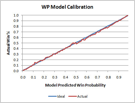
But it's not that simple. I don't want the model to be correct 100% of the time when it says a team has a 0.80 WP. I want it to be wrong sometimes. Specifically, in this case I'd want it to be wrong 20% of the time. If so, that's a good feature of any probability model. This is what's known as model calibration.
The graph below illustrates my WP model's calibration. The blue line is what would be the ideal calibration, and the red line is the actual. As you can see, it's nearly perfect. Whenever the model says a team as a 0.25 WP, it goes on to win 25% of the time. And when it says a team has a 0.35 WP, it goes on to win 35% of the time, and so on.
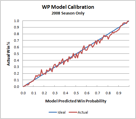
That graph is slightly deceptive, however. The model is essentially "predicting the past." In other words, it's using the same game data it was originally built on to test itself. (There is so much data in the sample, I doubt this is really an issue.) Actually, the model is based on data from the 2000 through 2007 seasons. So here is the model applied to the 2008 season, which was not included in the 'training data.'
We see the same tight symmetry, which is what we're looking for. Of course, there is naturally more noise because of the smaller sample, but that's completely expected. I do notice that the actual values 'sag' a little toward the upper end of the scale. This may suggest that the model is very slightly (but possibly systematically) undervaluing possession when teams have large leads early in a game or small leads late in a game. That's something worth investigating.
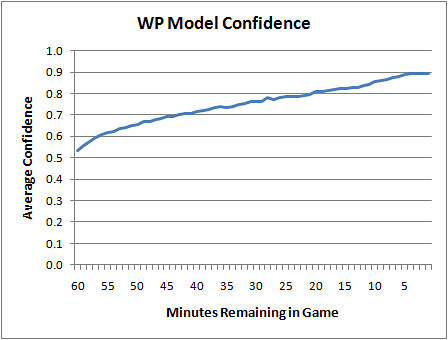
But calibration is only half the story. Consider a WP model that always said each opponent had a 0.50 WP no matter what the score was. Technically, it would be perfectly calibrated. It would end up being correct exactly 50% of the time. So aside from calibration, we'd want a model to be confident. If a model possessed God-like omniscience, it would have 100% confidence as soon as kickoff. Obviously, we can't do that (even for games against the Lions). But as long as the calibration is sound, the higher the model's confidence the better.
Here is a plot of the WP model's confidence by game minutes left. At kickoff, it's a 50/50 proposition, and then as the game unfolds it becomes clearer who has the upper hand. Even in the final minute, it's not totally clear which team will win, and that's part of what's great about the NFL.
Needless to say, I'm very pleased with these results. But this isn't a testament to clever modeling or brilliant research. It's simply due to the wealth of data I started with. Even so, I'm currently working on major improvements that I hope will be ready for the upcoming season.
Are NFL Coaches Too Timid?
Risk is at the heart of football strategy. Aggressive, risky gameplans should result in boom-or-bust high-variance outcomes, sometimes scoring lots of points but sometimes scoring very few. Conservative gameplans result in relatively consistent low-variance outcomes. Teams would more likely score close to their average score.
In this post, I’ll look at what high and low variance strategies would look like in terms of point totals and how they affect each team’s chances of winning. I’ll also compare the theoretical strategies to the actual distributions in the NFL. We'll see why NFL coaches should be more aggressive when they're the underdog.
High Variance Strategy in Basketball
Some time ago, I came across an article posted by basketball researcher Dean Oliver that analyzed high and low variance strategies for the NBA. Oliver calculated the win probability of each opponent according to the mean and standard deviation (SD) of each team’s scoring tendencies. SD represents the degree of variance. The more aggressive and riskier the strategy, the higher the SD will be. For example, a basketball team that shoots lots of 3-pointers would have a high variance.
The key to accurately modeling basketball is realizing that each team’s score is correlated with that of its opponent. The pace of a basketball game ties each team’s score together, and there is a high level of covariance. When one team scores a high number of points, the other team will tend to score more too. Game scores are interdependent.
In Football
Recently the Smart Football blog illustrated the advantage of high variance strategies for underdogs. A high variance strategy increases an underdog’s chances of winning but comes with the cost of also increasing its chances of being blown out.
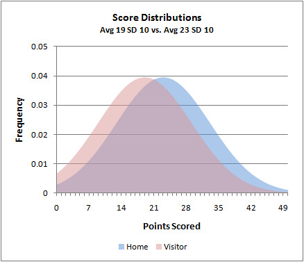
In the NFL as a whole, visiting teams average about 19 points with a SD of 10 points while home teams average about 23 points with a SD of 10 points. But unlike basketball, football opponent scores are negatively correlated. This makes intuitive sense because the better one team does, the worse the other should do. If one team gets lots of first downs and doesn’t commit turnovers, its opponent will usually start drives with poor field position, and vice versa. The covariance between NFL opponent scores is -1.9 points-squared.
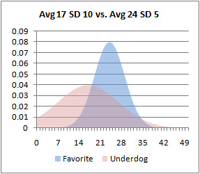
If NFL scores were normally distributed, this is what the typical score distribution would look like. The visitor scores are in red and the home scores are in blue.
We can calculate each team's chances of winning by summing all the probabilities with these distributions and factor in the covariance using Dean Oliver’s method. This estimates that the home team wins 56.5% of the time, which happens to be exactly the NFL actual home field advantage.
Disclaimer
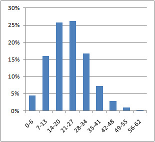
There’s one problem. NFL scores are not normally distributed, primarily due to its unique scoring, which typically comes in chunks of 3 or 7. Here is what the actual distribution of scores looks like.
The good news is, if we group the scores into bins of 7 points, we get a quasi-normal distribution. (Technically, it may be more of a gamma or Poisson distribution.) I’m going to stick with normal distributions to simplify the math and to better illustrate the concepts I want to convey.
Demonstration
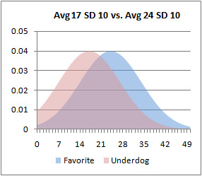
Here’s why underdogs should play aggressive and risky gameplans. Take an example where one team is a 7-point favorite over its underdog opponent. Say the favorite would average 24 points and the underdog would average 17 points. With a SD of 10 points for each team, the underdog upsets the favorite 31.5% of the time. The favorite’s scoring distribution is blue and the underdog’s is red.
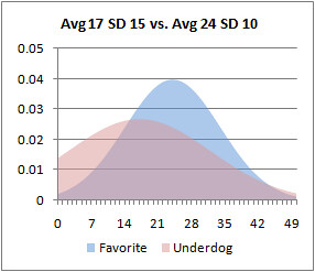
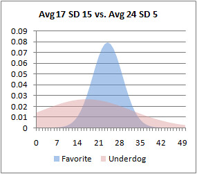
But if the underdog plays a more aggressive high-variance strategy, increasing its SD to 15 points, it would upset the favorite 35.3% of the time.
Note that I haven’t increased the underdog’s average score in any way, just its variance. The increase in its chance of winning results due to more of its probability mass moving to the right of the favorite’s mean score of 24. In fact, the higher the variance, the wider the probability mass will be spread. Consequently, more mass will be to right side of the favorite’s average score. But more mass will also be to the left, meaning there is a higher risk of an embarrassing blowout.
Even if employing a high-variance strategy is non-optimum, it can still help an underdog. In other words, even if an aggressive gameplan results in an overall reduction in average points scored, it often still results in a better chance of winning.
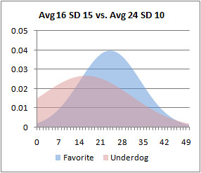
The next graph plots the scoring distributions of just such a scenario. Like before, the favorite’s average score is 24 with a SD of 10. But this time the underdog’s average is reduced from 17 to 16. The increase in variance still results in a slightly better chance of winning despite its overall reduction in average points scored. In this case, it's 33.2% for the underdog.
What about the favorite? Should it increase its variance in response to an aggressive underdog? No. Ideally it should play as consistently as possible. The lower the variance the better for the favorite. The next example shows a favorite playing a low-variance game with an average of 24 points and a SD of 5 points. The underdog is playing conventionally with a 17 point average and 10 point SD. The result is an increase in the favorite’s chances of winning from 69.5% in the original example to 73.0%.
And if the underdog plays an aggressive high-variance game, the low-variance strategy is still better for the favorite. In this case the favorite still improves its chances of winning from 64.7% to 67.8%.
In Practice
So what does any of this mean in the real world? Simply put, to win more often underdogs should employ a high-variance strategy from the beginning of the game. It shouldn’t wait until the 4th quarter and become desperate. Go for it on 4th and short, run trick plays, throw deep, and blitz more often. Roll the dice from the get-go.
The real question is, what is the optimum level of risk? I’m not sure, but I do know NFL coaches are operating far from it.
Looking at games from the ’02 through ’06 seasons (a total of 1280), underdogs do not increase their variance. For example, for games in which the point spread is between 6 and 7.5 points, the underdog’s SD is 9.8 points, slightly less than the overall league average. Ideally, it should be higher. The favorite’s SD is 10.4 points when ideally it should be lower.
The table below lists the SDs of points scored for the favorite and underdog according to the most common point spreads.
| Spread | Favorite SD | Underdog SD |
| 0 - 1.5 | 9.6 | 10.5 |
| 2 - 3.5 | 9.8 | 9.4 |
| 6 - 7.5 | 10.4 | 9.8 |
| 10 - 11.5 | 10.5 | 8.7 |
If anything, there appears to be slight trends in the exactly wrong directions. The bigger the spread, the smaller the underdog’s variance and the bigger the favorite’s variance. It appears underdogs may get less aggressive while favorites may get more aggressive.
Conclusions
This is more evidence coaches do not coach to maximize their team’s chances of winning. My theory is coaches are delaying elimination until the latest point in the game—that is, trying to “stay in the game” for as long as possible. Underdog coaches minimize risk all game long hoping for a miracle along the way. They seem to be reducing the chances of being blown out, but this is not consistent with giving their team the best chance to win.
But if you think about it, this kind of approach might be good for the NFL as a whole. It keeps games entertaining as long as possible, and keeps viewers tuned in.
Coaches of favored teams could be accused of the same crime. They might be playing with too much variance. But there is certainly a limit to just how consistent a team can be, no matter how hard it tries. There will always be random variation in team performance. I suspect a SD of 10 points may be near that limit, and that coaches of both favorites and underdogs simply play the least risky game they can consistent with accepted conventions.
NHL In-Game Win Probability
I was at an NHL game the other night, and with the score 2-0 someone asked me, “So Mr. Win Probability, what’s the chance the Capitals win?” I was caught off guard, and after I choked out, “I…don’t…know…,” I experienced the horror that is not knowing the exact up-to-the-second win probability of a sporting contest. Don’t let this happen to you.
The anxiety and shame lasted for two days straight. I kept blaming myself and replaying the incident over and over in my head. The only way to cure my depression was to build a win probability model for NHL hockey.
Unlike my previous models for basketball and football which were empirically based, my hockey model is theoretical. In other words, instead of being based on a massive database of actual previous games, the probabilities are calculated based on a Poisson scoring distribution. The distribution is calculated using the average goals scored per minute in the 2008-9 NHL season. It’s an extension of the model I developed in this post.
Teams score an average of 2.79 goals per 60 minutes of regulation time, which is equal to 0.0465 goals per minute. A Poisson distribution based on that per-minute scoring rate and the time remaining in the game yields the probabilities of each team scoring each number of possible goals by the end of the game. Summing up all the probabilities of all the possible combinations of final scores gives the game’s win probability.
Here’s the graph:
There are a couple wrinkles to address. First, there are power plays. When a team as a man advantage on the ice, it’s much more likely to score. About one in five power plays results in a goal for the team with the advantage. Only about 2% of the time the short-handed team will score. So at the start of a power play, a rough approximation would put the win probability a little less than one fifth of the way toward the next best curve.
For example, if the score is 2-0 with 30 minutes remaining in the game, the win probability would normally be about 13% for the trailing team (the red line). But at the beginning of a power play, the trailing team’s win probability would jump about a fifth of the way up to the ‘down by 1’ line (blue). A rough approximation puts the new win probability at 16%. Then as the power play expires and there’s no score, the win probability would gradually return to the ‘down by 2’ line.
Second, there is the ‘end-game,’ when teams down by a goal will pull their goalie in favor of an additional skater. That would increase the win probability of the trailing team slightly, but only half as much as you might expect. They’d still only be buying an opportunity in overtime. But it could still be factored in. Before I do, I’d need some data on end-game goals.
One advantage of a theoretical approach over an empirical model is that team strength can be factored in far more easily. In an empirical model, when you divide up the data by various classes of team strength, the data is sliced into tiny fragments, usually with very small and unreliable sample sizes. Theoretical formula-based models don’t suffer from that problem. I can simply adjust the mean goals scored and goals allowed for any particular opponent, then rerun the model. The resulting model would be tailored to the specific match-up instead of a generic model for the league as a whole. Home ice advantage can be factored in with a similar approach.
Remember, WPD (Win Probability Dysfunction) can happen at any time, and it’s nothing to be ashamed of. Don't analyze win probability graphs if you take nitrates, often prescribed for chest pain, as this may cause a sudden, unsafe drop in blood pressure. Discuss your health with your doctor to ensure that you are healthy enough to view win probability graphs. If you experience chest pain, nausea, or any other discomforts during a sporting contest, seek immediate medical help. In the rare event of viewing win probability graphs more than 4 hours, seek immediate medical help to avoid long-term injury.
Live NHL win probability graphs now online.
Earthquakes, Kevin Bacon, The Financial Crisis, and Pro Bowl Selections
Most of the analysis I do at this site is based on the normal distribution (aka Gaussian aka bell curve). Team records, yards per attempt, sack rate, turnovers, and just about everything else follow a bell curve distribution where most teams or players are bunched around the average and a rapidly diminishing number are found at the extremes. Most of the statistical tools used here such as regression, correlation, or even simple averages are based on the assumption of a normal or quasi-normal distribution.
Normal distributions are ubiquitous in sports for mainly two reasons. First, the rules provide level playing fields, fixed boundaries, and predictable cause-effect relationships. Football games always last 60 minutes, the field is always 100 yds long, a touchdown is always 6+ points, and a win is always a win no matter how close the score. Second, there is a significant amount of random luck involved in sports, which by definition is always distributed normally.
Other distributions with different shapes appear in sports. Recently I looked at how sports like soccer, lacrosse, and particularly hockey are better modeled with Poisson distributions.
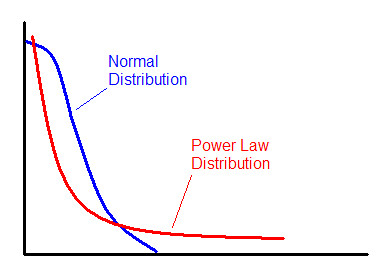
There are other distributions that often appear in nature and in sports that are completely unlike the bell curve most of us are familiar with. The power law distribution is a prime example.
The Power Law
Have you ever noticed how most of the productivity around your office seems to be accomplished by a minority of your co-workers? It’s no different in the NFL, or most anywhere else.
The power law is all around us, and is a fundamental property of natural organizations of all types. City sizes, for example, are distributed according to the power law. There are a few extremely large cities, more average sized cities, and very many smaller towns. Earthquake sizes, the structure of the Internet, stock market gains and losses, body mass indexes, gravity, social network connections, wealth distributions, and even Kevin Bacon movies all follow power law distributions. If you've ever heard people refer to the "fat tail" or the "long tail," this is what they're referring to.
The power law distribution follows this equation:
where x and y are variables and a and b are constants. The constant b is known as the scaling exponent.
The Financial CrisisOur current financial crisis was in part caused by a fundamentally wrong assumption about risk distributions in the debt markets. An oversimplified explanation is that investment companies made lucrative but risky investments, and then hedged against their failure by buying insurance in the form of complex derivatives in case they went bust. These companies thought that they had cracked the code and solved the problem of risk once and for all. (One of the reasons the company AIG is central to the problem is that it's the company that led the selling of all that insurance.)
The problem was that the insurance was priced based on an assumption of bell curve distributions of market risk. A model known as the Correlated Gaussian Copula was developed by a Chinese mathematician named Li, and it was widely used throughout the financial industry for measuring and pricing risk. Unfortunately, financial markets act more like earthquakes than normally distributed phenomena like rainfall or human height. There are lots of minor fluctuations but occasionally the bottom drops out. The power law distribution has a ‘fatter tail’ at the extremes than the normal distribution, meaning extreme outcomes are considerably more likely.
Network Organization
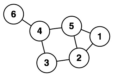
One reason we see power law distributions so often is because they are a signature of networks. The picture below could represent a computer network, a social network, highways between cities, or airline routes. But let’s say it represents business connections among individuals. If you’re an entrant into that business market and had the resources to afford to establish a single link, who would you prefer to hitch your wagon to?
I’d want to be associated with someone who is already well-connected. I’d want to connect to #4 or #5. Each already has 3 connections and is no more than 2 degrees removed from any other member of the community. I’d avoid #1 and especially #6. They have fewer connections and are further removed from the rest of the group.This process tends to enrich nodes that already have a large number of links. Once the decision is made to link to either #4 or #5, that node would now be even more attractive to subsequent entrants. In organizations like this, the number of links for each node follows the power law distribution.
Scale Invariance
The fundamental feature of power law distributions is ‘scale invariance.’ For example, if you count cities of a certain size, cities half has large might be four times more common, and cities twice as large might be four times less common. If this pattern holds throughout the full range of cities, then you have scale invariance. This relationship means there is no typical city size. There will still be an arithmetic mean, but it won’t actually be the ‘average’ the way we understand it. There really is no average.
Success in College Football
What does any of this have to do with football? First, compare the NFL with college football. Think of the teams as strongly-linked clusters of individual players and coaches in the network of the overall league. The teams themselves are in turn linked and clustered by division or conference.
In college ball, elite players choose their team largely on their own, and it’s no surprise that they select their team based on the team’s current strength and the prominence of the coach. Players who aren’t recruited by the USCs and LSUs of the world will still prefer PAC 10 or SEC teams. And failing that, they’ll prefer any Division IA (or “Bowl Series”) school to the lower divisions and conferences.
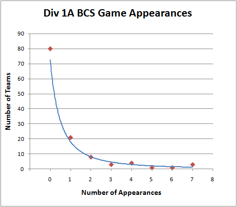
The NFL is constructed differently. With the salary cap and the draft, the better players are distributed more evenly throughout the league. Its distribution of championship appearances is decidedly not a power law distribution. But BCS appearances by college teams certainly is:

Pro Bowl Selections
What does follow a power law distribution in the NFL is Pro Bowl appearances. Just like in your office where a minority of employees can account for most of the productivity, the talent in the NFL is distributed in a similar way. In doing my analysis for drafting defensive backs I noticed just how much Pro Bowl selections were concentrated among the top players.
Among all the defensive backs drafted from 1980 through 2001 who have had at least one year as their team’s primary starter, the distribution looks like this:

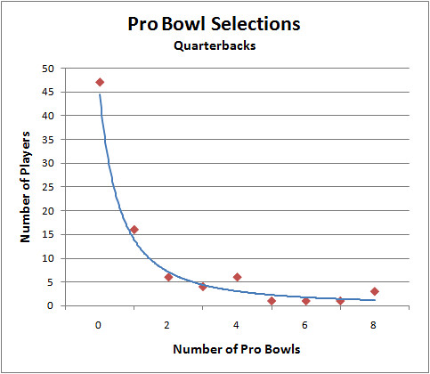
There are plenty of players with no appearances, a smaller group with 1 selection, and then a steadily decreasing number of players with 2, 3, 4, etc. selections. As you can see, the distribution approximates a typical power law distribution.
Here is the distribution for QB Pro Bowl selections. It approximates a power law distribution even better.

What does this tell us about Pro Bowl selections? Does this mean that being chosen for the Pro Bowl is based on how connected a player is? Partly--because the votes of other players and coaches weigh heavily in the selections, but that’s not what I’m getting at. Besides raw performance, it also depends on how popular the player is, how good the rest of his team is, how often the team plays on national TV, and how good he was in previous years. And all those things are correlated with each other--it's a complex self-organizing system of factors and influences. That’s one reason why we see the power law at work here.
Coaching Tenure
Another example of the power law in football is the tenure of coaches. This paper from the UK found that coaching tenure in the Premier League follows a power law very closely. They even looked at NFL coaching tenure and found the same pattern. I’ve done my own analysis and confirmed that coaching tenures in NFL obey the power law distribution. What the researchers conclude is that talent and ability has relatively little to do with how long a coach hangs on to his job. It mostly has to do with being ‘sacked’ or ‘poached,’ and with the random luck of his team. (For instance, Jon Gruden was poached from Oakland and sacked at Tampa Bay). Interestingly, the tenure of leaders of many kinds including Popes, British Prime Ministers, and Roman Emperors follow power law distributions.
Player Tenure
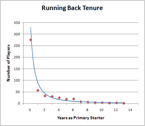
Although career length does not follow a power law distribution, years as a starter does. For example, of all the RBs drafted between 1980 and 2000, the majority will never be a starter, and the rest of the players have steadily decreasing chances of lasting long as a starter. Here is the distribution:

Why Any of This Matters
Power law distributions are noteworthy because they are the signatures of mature self-organizing complex systems. It’s also a feature of ‘rich-get-richer’ systems. So when we see power law distributions, we can make some qualitative inferences about the system we’re observing. For example, the BCS system is certainly a rich-get-richer organization. We can even quantify just how hierarchical it is and how difficult it is for second-tier teams to break into the elite.
The problem with the BCS isn’t just that it’s a rich-get-richer system. That’s just the natural way of the world. Even in supposedly ‘egalitarian’ systems like socialism, the rich still get richer. The difference is that initial outcomes in socialist systems are based primarily on one’s political connections, where in a free market they tend to be based on how productive or innovative one is. The problem is that the elite ‘nodes’ of the BCS have colluded to preserve their status on top, preventing a natural churn in who the elite are.
Understanding the implications of power law distributions also helps make more accurate models. For example, there really isn’t an average coaching tenure, and the standard deviation of tenure is not a meaningful statistic. Instead of applying the normal distribution and its associated analytical tools to everything we see, we should be more cautious.
If anyone is interested further in network theory and power law distributions, I recommend the book Nexus: Small Worlds and the Groundbreaking Theory of Networks. Regarding the current financial crisis and the misapplication of risk models, I recommend this prophetic 2005 WSJ article.
Comparitive Modeling: Hockey as a Poisson Process 2
In the last post, I discussed how the Poisson distribution can model scoring in hockey (and other sports such as soccer and lacrosse). I looked at how we can estimate a team's "true" expected winning percentage based on their average goals scored and allowed.
In this post, I'll illustrate how the same method can estimate the probability of which team will win a particular game. I'll also calculate the probability of which team would win a best-of-7 series.
Let's say the Washington Capitals are playing the Boston Bruins. The Bruins score 3.3 goals per game and allow 2.2, while the Caps score 3.1 goals per game and allow 2.8. (Actually, those are goals per 60 minutes of regulation play. I exclude OT goals and shoot-out goals.)
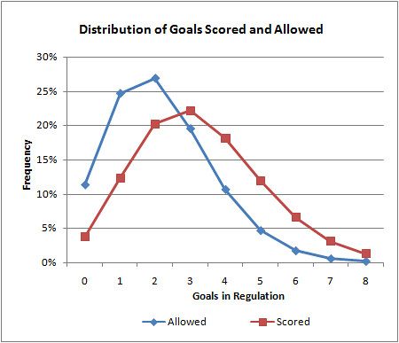
The Bruins' goal distributions look like this (from the last post):
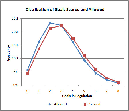
And the Caps' goal distributions look like this:
The Bruins are clearly the better of the two teams. Their goal distribution is skewed higher than their goals allowed. The Caps' distributions are closer together.
The average goals per game in the NHL is 2.8. When the Caps' 3.1 G/gm offense goes up against the Bruin's 2.2 G/gm defense, we could expect the Caps to score 2.5 G/gm. I look at it this way: 2.2 G/gm is 0.6 G/gm less than average for a defense. The Caps would therefore score 0.6 G/gm less than they usually do.
And because the Caps allow the league-average number of goals per game (2.8), we could expect the Bruins to score their season-long average of 3.3 G/gm. Now we have baseline expected scoring rates for each team in this particular match-up. The resulting Poisson distributions look like this:
Like I did in the last post, we can add up the probabilities of each possible goal combination. All of the permutations in which the Bruins win add up to 54.7%, and all the permutations in which the Capitals win add up to 29.2%. They'd tie in about 16% of the games, so if we split those games evenly, we get a 62.7% chance that the Bruins would win.
But this doesn't account for home ice advantage (HIA). In the NHL, the team with home ice wins about 55.4% of the time. Using a logistic adjustment (that is described in detail here), we can translate HIA into a logit value of 0.094. The Bruins' 62.7% win probability translates into a logit value of 0.520. Add them together if the game is at Boston, subtract the HIA logit from the game probability logit if the game is at Washington. Assuming the game is at Washington, we get a net logit of 0.426, which translates into a win probability of 62.7% for the Bruins. If the game were at Boston, it would be a 64.9% win probability for the Bruins.
At this point in the NHL season, the top playoff spots are already claimed. So many fans are more interested in how a best-of-7 playoff series would turn out. Given the Poisson model game probabilities, the Bruins would have a 76.1% chance of winning a playoff series vs. the Capitals.
Rather than post NHL game probabilities and series probabilities for the next few months (I'm not that interested in hockey), I've made my Excel spreadsheet available for anyone who's interested. I made a handy little interface with 2 drop down menus to select which teams you're interested in. It will calculate team expected winning percentages, game probabilities, and series probabilities.
Note that this model does not consider the end of game situations in which a trailing team pulls its goalie in favor of an additional skater. I would suspect this causes a slight amplification of goals scored for good teams, and goals allowed for poor teams. It would make ties slightly more likely than the model would expect, and it would make 2-goal victories slightly more common and 1-goal victories slightly less common than expected.
I'll repeat my disclaimer from part 1 of this post. I doubt much of what I've done here is original at all. In fact, in the past couple days I found a few hockey stats sites which I'm certain cover Poisson modeling and much more.
Comparitive Modeling: Hockey as a Poisson Process 1
There's a lot to be learned about what makes football unique from other sports. I recently built a live win probability model for NCAA basketball, and now I've started looking at NHL hockey. Instead of doing the same kind of win probability modeling, which would nevertheless be interesting, I thought I'd take a completely different approach.
Let's say you have a hockey team that scores 3 goals per 60 minute game. How likely are they to score exactly 3 goals? 2 goals? 4? The Poisson distribution can tell us.
Given that there are on average x occurrences of an event over a time period, the probability there will be exactly k occurrences is:
Hockey is an example of a fluid sport, and it's ideal for Poisson analysis. The clock rarely stops and control of the puck goes back and forth between teams often, and much of the time it's not even clear if either team has control. Goals are relatively rare, and are approximately equally likely to occur at all moments throughout a game. Soccer and lacrosse are also examples of this type of sport.
This season NHL teams score an average of 2.8 goals per 60 minutes. To calculate the probability of a team scoring exactly 3 goals in a game, the Poisson distribution tells us it's 0.22. The probability of a shutout, zero goals, is 0.06.
We can go further and apply this to specific teams. For example, the Boston Bruins, which are currently the NHL's top team, score 3.3 goals/game and allow 2.2 goals/game. Their distribution of goals scored and allowed for a single game are plotted below. As you can see, the higher goal amounts are obviously going to be more common for goals scored than allowed.
How is this useful? We can calculate the Bruins' expected winning percentage by summing the probabilities of all the possible combinations of outcomes--1 to 0, 2 to 0, 2 to 1,...The cumulative probability of all outcomes in which the Bruins outscore their opponents reveals an expected win%, similar to the Pythagorean expectation developed originally for baseball.
Using this method, the Bruins can be expected to win 60.0% of the time outright. In 15.8% of games, they can be expected to be tied at the end of regulation. Overtime in hockey is a single 5 minute sudden death period followed by a shoot out if necessary.
OT outcomes are far more random than the rest of the game because it's not who scores the most; it's who scores first. Besides, a tied game in regulation suggests the teams are relatively evenly matched, at least on that day. So for now, let's say the Bruins will win half of their OT games. They should be a .679 team, and in fact, they're currentlly at .642. We might say, if anything, they're a little better than their record indicates.
In part 2, I'll describe a method for estimating game probabilities for particular team match-ups. But before I sign off, I want to be clear that I doubt anything I've done here is original. I know for a fact that hockey analytics guys use Poisson modeling extensively. And I doubt this has much relevance to football. In fact, that's the point. It's unlikely that there's much about football that is Poisson, and that's worth understanding (if true). Besides, I like to investigate what make various sports unique.
How the Model Works--A Detailed Example Part 2
This is a continuation of an article that details exactly how my predictions and rankings are derived. You can read part 1 here. To recap, I'm using the Super Bowl match-up between the Steelers and Cardinals as an example. So far, we've used a logistic regression model based on team efficiency stats to estimate the probability each team will win.
We haven't accounted for strength of schedule yet. For example, the Steelers may have the NFL's best run defense, yielding only 3.3 yds per rush. But is that because they're good or because their opponents happened to have poor running games?
To adjust for opponent strength, we'll first need to calculate each team’s generic win probability (GWP), or the probability of winning a game against a notional league-average opponent at a neutral site. This would give us a good estimate of a team’s expected winning percentage based on their stats.
Since we already know each team’s logit components, all we need to know is the NFL-average logit. If we take the average efficiency stats and apply the model coefficients we get Logit (Avg) = -2.52.
Therefore, for the Cardinals, a game against a notional average opponent would look like:
= 0.07
The GWPs I calculated for Arizona and Pittsburgh were based on raw efficiency stats, unadjusted for opponent strength. That’s ok if we assume they had roughly the same strength of schedule. But often teams don’t, especially in the earlier weeks of the season.
To adjust for opponent strength, I could adjust each team efficiency stat according to the average opponents’ corresponding stat. In other words, I could adjust the Cardinals’ passing efficiency according to their opponents’ average defensive efficiency. I’d have to do that for all the stats in the model, which would be insanely complex. But I have a simpler method that produces the same results.
For each team, I average its to-date opponents’ GWP to measure strength of schedule. This season Arizona’s average opponent GWP was 0.51—essentially average. I can compute the average logit of Arizona’s opponents by reversing the process I’ve used so far.
The odds ratio for the Cardinals’ average opponent is 0.51/(1-0.51) = 1.03. The log of the odds ratio, or logit, is log(1.03) = 0.034. I can add that adjustment into the logit equation we used to get their original GWP.
= 0.11
This makes the odds ratio e0.11 = 1.12. Their GWP now becomes 0.53. If you think about it intuitively, this makes sense. Their unadjusted GWP was 0.51. They (apparently) had a slightly tougher schedule than average. So their true, underlying team strength should be slightly higher than we originally estimated.
I said ‘apparently’ because now that we’ve adjusted each teams GWP, that makes each team’s average opponent GWP different. So we have to repeat the process of averaging each team’s opponent GWP and redoing the logistic adjustment. I iterate this (usually 4 or 5 times) until the adjusted GWPs converge. In other words, they stop changing because each successive adjustment gets smaller as it zeroes in on the true value.
Ultimately, Arizona’s opponent GWP is 0.50 and Pittsburgh’s is 0.53. After a full season of 16 games, strength of schedule tends to even out. But earlier in the season one team might have faced a schedule averaging 0.65 while another may have faced one averaging 0.35.
My hunch is that it’s this opponent adjustment technique that gives this model its accuracy. It’s easy enough to look at a team’s record or stats to intuitively assess how good it is, but it’s far more difficult to get a good grasp of how inflated or deflated its reputation may be due to the aggregate strength or weakness of its opponents.
Now that we’ve determined opponent adjustments, we can apply them to the game probability calculations. The full logit now becomes:
(Team B logit + Team B Opp logit)
Pittsburgh’s opponent logit is log(0.53/(1-0.53)) = 0.10 and Arizona’s is log(0.50/1-.50) = 0.01. The game logit including opponent adjustments is now:
= -1.02
The odds ratio is therefore e-1.02, which makes the probability of Arizona winning 0.36. This estimate, based on opponent adjustments, is slightly lower than what we got for the unadjusted estimate. This makes sense because Arizona’s strength of schedule was basically average, and Pittsburgh’s was slightly tougher than average.
So there you have it, a complete estimate of Super Bowl XLIII probabilities and a step-by-step method of how I do it.
There are all kinds of variations to play around with. You can choose which weeks of stats to use, to overweight, or to ignore. You can calculate a team’s offensive GWP by holding its own defensive stats average in the calculations, and only adjusting for opponent defensive stats. The resulting OGWP tells us how a team would do on just the strength of its offense alone. It’s the generic win probability assuming the team had a league-average defense. DGWP is vice versa.
One variation I employ is to counter early-season overconfidence by adding a number of dummy weeks of league-average data to each team's stats. This regresses each team's stats to the league mean, which reduces the tendency for team stats to be extreme due to small sample size. For example, it takes about 6 weeks for a team's offensive run efficiency to stabilize near its ultimate season-long average. So at week 3, I'll add 3 games worth of purely average performance into each team's running efficiency stat. No team will sustain either 7.5 yds per rush or 2.2 yds per rush.
This entire process might seem ridiculously convoluted, but it’s actually pretty simple. You get the coefficients from the regression. You next calculate each team’s logit with simple arithmetic. Game probabilities and “GWP” are just a logarithm away. Opponent adjustments require a little more effort, but in the end, you just add them into the logit equation.
Voila--a completely objective, highly accurate NFL game prediction and team ranking system.
How the Model Works--A Detailed Example Part 1
One of the most common requests I get is to write up a complete sample game probability calculation. In this article, I'll explain how the model works and do a full detailed example using the upcoming Super Bowl between the Steelers and Cardinals.
When I originally constructed this model, the goal wasn’t to predict game outcomes but to identify how important the various phases of the game were compared to the others. In order to do that, I had to choose stats that were independent of the others, or at least as independent as possible.
There were several options, such as points scored and allowed, total yards, or first downs. But if I’m trying to measure the true strength of a team’s offensive passing game, passing touchdowns may not tell us much. A team may have a great defense that gives them good field position on most drives, or it might have a spectacular running back that can carry the offense into the red zone frequently. So points or touchdowns won’t work.
The other obvious option is total yards. But losing teams can accumulate lots of total passing yards late in a game's “trash time.” Or a team can generate lots of pass yards simply because they pass more often. That really doesn’t tell us how good a team is at passing. Total rushing yards presents a similar problem. A team with a great passing game can build a huge lead through three quarters, and then run out the clock in the 4th quarter accumulating a lot of rushing yards.
First downs made or allowed tells us a lot about how good an offense or defense is, but it doesn’t tell us anything about the relative contributions of the running and passing game of a team.
So, the best choice is going to be efficiency stats. Net yards per pass attempt and yards per rush tells us about how good a team truly is in those facets of the game. They are also largely independent of one another—not completely, but about as independent as possible.
Turnovers are also obviously critical. But total turnovers can be misleading just like total yards. Teams that pass infrequently may have few interceptions, but it may only be because they simply have fewer opportunities. So I also use interceptions per attempt, and fumbles per play.
So the model starts with team efficiency stats. But I don’t use all of them. For example, I throw out defensive fumble rate because although it helps explain past wins or losses, it doesn’t predict future games. A team’s defensive fumble rate is wildly inconsistent throughout a season, which suggests it’s very random or mostly due to an opponent’s ability to protect the ball. Forced fumbles and defensive interceptions show the same tendency. In the end, the model is based on:
The model is a regression model, specifically a multivariate non-linear (logistic) regression. I know that sounds very technical, but the general idea behind regression is pretty intuitive. If you plotted a graph of a group of students’ SAT scores vs. their GPA, you’d see a rough diagonal line.We can draw a line that estimates the relationship between SAT scores and GPA, and that line can be mathematically described with a slope and intercept. Here, we could say GPA = 1.5 + 2 * (test score).
Regression is what puts that line where it is. It draws a line that minimizes the error between the estimated GPA and the actual GPA of each case.
We can do the same thing with net passing efficiency and season wins. We can estimate season wins as Wins = -6.5 + 2.4*(off pass eff). Take the Cardinals this year. Their 7.1 net passing yds per attempt produces an estimate of 10.7 wins. They actually won 9, so it’s not a perfect system. We need to add more information, and that’s what multivariate regression can do.
Multivariate regression works the same way but is based on more than one predictor variable. Using both offensive and defensive pass efficiency as predictors, we get:
For the Cardinals, whose defensive pass efficiency was 6.5 yds per att in 2008, we get an estimate of 9.4 wins.
Adding the rest of the efficiency stats to the regression, we can improve the estimates even further. Unfortunately, linear regression, like we just used, can sometimes give us bad results. A team with the best stats imaginable would still only win 16 games in a season, but a linear regression might tell us they should win 21. Additionally, linear regression can estimate things like the total season wins, but it can’t estimate the chances of one team beating another. That’s where non-linear regression comes in.
Non-linear regression, like the logistic regression I use, is best used for dichotomous outcomes such as win or lose. A logistic regression model can estimate the probabilities of one outcome or the other based on input variables. It does this by using a logarithmic transformation, which is a fancy way to say taking the log of everything before doing all the computations. After computing the model and its output just as you would with linear regression, you “undo” the logarithm by taking the natural exponent of the result. Technically, logistic regression produces the “log of the odds ratio.” The odds ratio is the familiar “3 to 1” odds used at the race track, which can be translated into a probability of 0.75 (to 0.25).
Logistic regression would be useful if, instead of predicting GPA, you wanted to predict a student’s probability of graduation. Graduation is a yes-or-no dichotomous outcome, and winning an NFL game is no different. We can use the efficiency stats, that we already know contribute to winning, to estimate the chances one team beats another.
As an example, let’s compute the probability each opponent will win the upcoming Super Bowl based on offensive rushing efficiency alone. Based on the regular season game outcomes from 2002-2007, the regression output tells us that the intercept is zero and the coefficient of rushing efficiency is 0.25. The model can be written:
= 0.25*(3.46) – 0.25*(3.67)
= -0.052
The odds ratio, would be e-0.052 = 0.95. In other words, based on offensive running alone, the odds Arizona wins would be 0.95 to 1. In probability terms, this is 0.49, giving Pittsburgh the slightest edge. Another way of saying this is, holding all other factors equal, Pittsburgh’s advantage in rushing efficiency gives them just a 51% chance of winning.
[Note: You can translate odds ratios into probabilities by using prob = odds/(1+odds).]
Now we can do the same thing, but with the full list of predictor variables. The independent “input” variables are the efficiency stats for each team, and the dependent variable is the dichotomous outcome of each game—either 1 for a win or 0 for a loss. My handy regression software tells us that the model coefficients come out as:Coefficient Value Constant -0.36 Home Field 0.72 O Pass 0.46 O Run 0.25 O Int -19.4 O Fum -19.4 D Pass -0.62 D Run -0.25 Pen Rate -1.53
The “logit,” or the change in the log of the odds ratio, can be written as:
or
- 0.46*(team B off pass eff) – 0.25*(team B off pass eff) - …
We have the constant, the home field advantage adjustment, and the sum of the products of each team’s coefficients and stats. The equation will eventually tell us Team A’s odds of winning, so we add its component logit and we subtract Team B’s. If Team A is the home team, we add the home field adjustment (0.72 * 1). If not, we can leave it out (0.72 * 0).
Now let’s look at Arizona and Pittsburgh in terms of their probability of winning Super Bowl XLIII. I’ll compute both teams’ logit component, combine them in the overall logit equation, then convert it to probabilities. To keep things simple, I’m going to only use team stats from the regular season for this example.
Arizona’s logit component would be:
= -2.45
Pittsburgh’s logit component would be:
= -1.51
Because the Super Bowl is at a neutral site, I’ll only add half of the home field adjustment when I combine the full equation.
= -0.93
Therefore the odds ratio is e-0.93 = 0.39. That makes the probability of Arizona beating Pittsburgh at a neutral site equal to 0.39/(1+0.39) = 0.28. Pittsburgh’s corresponding probability would be 0.72.
(Notice how the constant and the home field adjustment cancels out to zero for a neutral site.)
In part 2 of this article, I'll explain how I factor in opponent adjustments and how I calculate a team's generic win probability (GWP)--the probability a team would win against a league-average opponent at a neutral site.
Single-Point-Failure Model of the Passing Game
Baseball has long been considered the easiest of professional sports to model and analyze mathematically. It’s certainly far simpler than football. One reason baseball is easier to model is that the sport isn’t really a team sport, at least in the most mechanical sense. It’s an orderly series of one-on-one match-ups between pitchers and hitters. Fielding and base-running certainly matter at the margins, but it’s the pitcher-batter interaction that dominates most outcomes.
In contrast, every football play seems like a desperate, chaotic scramble of 22 players. Where baseball is a series system, football is more of a parallel one. In a very simplified way, much of a football play can be modeled as several simultaneous one-on-one match-ups. Take a simple pass play. Each pass blocker matches-up with a pass rusher, a back picks up a blitz or dog, and each receiver matches-up with a pass defender. (At least this would be the case with a man-on man pass defense. Zone defenses can be thought of in a very similar way as I’ll describe below.)
This kind of system is similar to a chain. If any one link fails, the entire system fails. No matter how well the other offensive lineman are blocking, if one lineman misses his block there’s probably going to be a sack. And if one pass defender blows his assignment, either by being beat in man-to-man or being in the wrong place in a zone, there’s a good chance for a big pass completion. This is why a football play can be thought of as a “point-failure” system.
Just like each player has a batting average, each offensive lineman could have a core probability of allowing a pass rusher to beat him and either pressure or sack the quarterback. Likewise, each pass rusher has a core probability of beating a blocker and getting to the QB. These baseline probabilities could be very low, but because it only takes 1 of the 5 pass rushers to be successful on any given play, the resulting chance of a hurry or sack grows considerably.
This is why having a world-class, Hall-of-Fame worthy tackle might not mean that much for a team’s overall pass protection, especially if there are weak blockers elsewhere on the same line. The math works out so that it’s better to have a line full of average blockers rather than a line of one all-pro and four slightly below-average colleagues.
For simplicity’s sake, say each pass rusher has a 5% chance of beating his blocker (within the likely time period before the throw). With 5 pass rushers on a pass play, the chance of any one of them getting to the QB would be 1 – (1-0.05)5), which is 0.23. So in this very simple model, the chance of any 1 of the 5 pass rushers hurrying, hitting, or sacking the QB would be 23%.
The receiver-defender match-ups would work similarly. Say there is a 5% chance a pass defender will either be beaten man-on-man or blow his zone assignment. It only takes one blown assignment for a failure to occur. No matter how well the other members of the secondary are doing, a single failure can lead to a big pass. With four defensive backs in coverage, this would put the overall chance of a wide open receiver at 1-(1-0.05)4) = 0.19.
So, in a very simple way, a passing play is like two chains under strain. One chain is the pass protection, and the other is the pass defense. Each link is a player vs. player match-up, and it has its own probability of breaking based on the abilities of the respective players. The first chain to break loses.
Can you imagine a football team with a starting player who is a point-failure in nearly every play? He'd be a lineman who always gets beat by a pass-rusher or a defensive back who always gets beat by a receiver. It would be ugly. Can you imagine any sport where this could be the case every game? Consider the National League, where pitchers are nearly always an easy out. In baseball, the failure of a pitcher at the plate is confined to his at bat.
So far, I’ve left out the most important player. The quarterback has to see open receivers and throw accurately to make big plays. He has maneuver in the pocket, and scramble from pass rushers. The QB is a big wildcard in my chain analogy.
I imagine this is how football video games like Madden are modeled, at least at the core. The game designers need to know what probabilities of allowing a pass rusher to beat a blocker should be to yield a realistic sack rate. Just looking at sacks alone, we can estimate a ballpark individual “sack allowed” rate is for individual linemen. Overall, the NFL sack rate is about 6.5%, so to solve for the baseline individual rate we can say:
-whole bunch of algebra-
x= 1.1%
Remember that’s an extremely rough figure because there are lots of other factors to consider, such as overload blitzes that linemen can’t handle or don’t control, or quick out passes that allow almost no chance of a sack. Plus we’re only counting sacks, not hits or hurries. So I’m only demonstrating a process, not declaring an answer, or even claiming there is a worthwhile answer. With such a low baseline rate and the NFL’s small sample sizes, it would be difficult in the extreme to grade a lineman purely statistically.
I'm only offering this analysis as a way of thinking about the sport. The only conclusion I’ll draw is a simple one. Ask yourself which is stronger, a chain with 10 links, or a chain of 20 links? It’s the shorter chain. If each link has a certain chance of breaking, you’d want the one with the fewest links.
Offensive passing systems that are heavy on multiple-receiver sets have a mathematical advantage. The more pass defense match-ups and the fewer the pass-rush match-ups an offense can create, the better. An offense would generally want the pass-rush match-ups to be the like the chain with fewer links, and the pass-defense match-ups to be the chain with more links. This way, there is a greater chance of a single point failure in the secondary and a lesser chance of one in the offensive line.
Again, I'm not proposing any sort of statistic to grade individual players. I'm just stepping back and examining why football is sometimes called the ultimate team sport.
Just for Kicks
Not everything I research gets posted here. 90% of it seems meaningless to me, so it's probably double meaningless to the rest of the world. But I thought I'd remove the filter, and just throw up some of the things I've used as building blocks in developing my win probability model. One of the important ingredients in any full model of football is kicking. So here are a couple of graphs you won't find interesting. No earth-shaking revelations about play calling, no bold counter-intuitive predictions, just data.
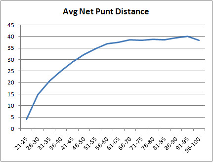
Punts average about 36 yards in the NFL. But where the punt takes place makes a big difference. Obviously, the closer to the end zone, the shorter a punt can be and the more likely a touchback is. The graph below plots the average net yards from punts at each position on the field. By field position, I mean line of scrimmage, not where the punter actually stood when he kicked.
(I know what you're wondering. Who the hell kicked a punt from inside the 25 yard line? Nov 12th, 2000, the Bengals trailed the Cowboys by 14 points with 13 minutes remaining in the 4th quarter. On 4th and 14 from the Dallas 24, Cincinnati lined up for a field goal. The Bengals "faked" the field goal attempt and made a "quick kick" according to the entry in the gamebook. From what I can tell, this was the intentional play and not an aborted play. The result was a touchback. Net gain: 4 yds. Dallas went on to kick a field goal and won the game. Whatever. Heck, throw a pass! An interception at the 5 probably leaves you better off.)
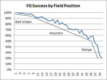
The other graph I'll show is field goal percentage by field position. Again, I'm referring to the line of scrimmage, not the silly "field goal distance" you get by adding 10 yards for the end zone and 7 yards for the snap.
I'll make one observation about modeling field goal kicks. Out to the 10 yard line, it seems like bad snaps or holds would be the biggest factor in missed kicks. From the 10 out to the 36 yard line, accuracy is the determining factor. Then outside the 36, range is the limiting consideration. I'm sure different kickers have different ranges, and environmental factors are very important, but you can see a slight inflection at the 36.