
 Back when I studied aerodynamics, the first thing we were taught was that we needed to assume air was an incompressible fluid, otherwise the math just gets too hard. But when my trusty old F/A-18 would approach the sound barrier, the air in front of the plane couldn't get out of the way fast enough, and aerodynamically, things got weird. To model the fluid dynamics of the air flow at these kinds of speeds you need to allow the air to be compressible.
I'm running into this exact same problem now as I am completing a big project on 4th down decisions. The compression of the field toward the end zone means defenses have less area to cover, and it becomes harder for offenses to move the ball. The region where this occurs is, of course, called the red zone. But is the 20-yard line really where the compression effect begins? And how strong is the effect?
We could look at average gain per play based on field position, and we’d see this graph where the decline in average gain begins around the 30 and becomes dramatically steep by the 20.
But this would be misleading because the endzone truncates longer plays. There’s no possibility of a 30-yd gain from the 20-yd line, but there is from the 30, the 40, and so on. So let’s look at it another way.
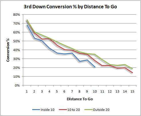
This graph plots the 3rd down conversion percentage by distance to go for three regions of the field: inside the 10, from the 10 to the 20, and outside the 20.
It looks like the 10 to 20 region is very similar to the rest of the field, but the Inside 10 region is where it’s noticeably tougher to convert. But even there the difference is relatively small.
These results could be interpreted another way. If the compression effect occurs at 3rd and 6 on the 15 yd line, then that series began at the 21. Therefore, we might as well say that the effect began, for practical purposes, at the 21. There are any number of ways to look at this, but this way happens to be what I need for the larger 4th down project.
Where Does the 'Red Zone' Really Begin?

published on 8/04/2009


Subscribe to:
Post Comments (Atom)
What if instead of yards/play by field position you graphed yards/(field position * play) by field position. In other words, instead of measuring raw yards, measure percentage of remaining distance covered.
Another thought would be to use your points expectancy formula, holding everything constant except field position, and graph the dExpectedPoints / dFieldPosition. That might be more accurate, but harder to pull off.
Interesting, but doesn't it seem like the strength of the compression effect will be different for each team, based on their run/pass preferences and their vertical/horizontal preferences (since the field becomes vertically but not horizontally compressed)? I saw Nick Saban give a talk where he described the whole field in zones: red, orange, green, yellow... The orange zone is defined as the zone where a field goal is likely to be converted, so your cost-benefit calculus becomes more conservative, since you likely already have some points on the table. Where this zone begins and ends depends on your kicker, and where the red zone takes over depends on your team's ability to gain tough yards against a zero-safety defense. So while there may be an average starting point for the red zone for the NFL overall, it may be one of those averages that describes none of the actual cases. I'll be interested to see how this analysis goes.
This is somewhat related to Cold, Hard Football Facts' Bendability Index, which is Yards Allowed/Points Allowed (linked on my name). I'm not quite sure how you'd tease out field position from that number, though. It might also be of interest to look at conversion on all downs from different field positions, since teams inside the 10 may aim for the endzone on each down. Finally, there has been much discussion of which area of the field conversion is most vital to success (cf. TMQ's Maroon Zone). This is quickly becoming one of my favorite football sites, and not just because of the thermodynamics. Keep up the good work!
What is the equation of the line in the first graph?
Perhaps you should try graphing the median number of yards gained per play at each position on the field. This would mute the effect of long plays from far away from the end zone. And you'd probably only see the effect of being too close to the end zone for effective measurement at around the 4 yard line or so with this measure.
Just from an analysis of the X's and O's alone, you can get a good understanding of why there is a continous probability phenomena occuring as an offense approches the goal line. Obviously, teams don't have to account for getting beat deep, thus safeties will play much closer (ie. more eight in the box schemes). Also the ground that each defensive player has to cover is less thus making them more efficient. Zone defenses probably have a lot to do with it as well since Defenses can create more chaos in short areas thus decreasing QB YPA dramatically. That would be an interesting study as well is how many Zone Defensive plays are chosen as teams get close to the goal line. Might explain more from a coaching standpoint.
Looking at pass completion percentage from different yards line (using the data from the 2005 season) it looks as though the passing red zone seems to start at around the 15. This is the point where pass completion percentage starts to drop off.
Interestingly there is also a drop off when teams are backed up against their own goal line. Presumably this is because QBs are trying to force the ball out to early reads to avoid giving up a safety, as there is no real 'compression' to speak of (most QBs don't drop 10 yards back so the end zone provides sufficient space to stand back and pass from).
Is it possible to inclue the top graph using medians rather than means?
It's possible, but it would take me several hours, and probably an hour even if I broke the field up into chunks (Excel pivot tables, my analysis tool of choice for stuff like this, does not do medians as far as I know).
Even if I did, I think it would be less helpful than we might think. I was a big fan of looking at medians rather than averages, for RBs for example. I finally got around to doing it. It took forever. What I eventually found was that every single RB had a median of 4 (except the top 2 RBs had 5).
This doesn't really tell us anything, and the reason is because gains are always recorded as whole numbers. So the median will always be a whole number too. In the case of RBs, we just get '4' except for an outlier to two.
I think it's a safe bet we'd see the same thing for yards per play for the NFL as a whole. I suspect it would be 5 yds for the entire length of the field up until we got to the 20 or 10 or so, when we would see it gradually shrink in whole number increments to 1 near the goal line.
But then again, that might tell us a lot.
You're probably right, I didn't think about the 1 yard increments in football stats (and really football is all about that big game changing play, we would lose those in a median). I just saw that noise when a team is within its own 20, and was wondering if there was any way to smooth it.
It actually isn't that hard in excel to do a conditional Median (learned this myself fairly recently):
{=MEDIAN(IF($A$2:$A$1000=Y1,$B$2:$B$1000)}
Where the curly braises are the "array method" (ctrl-shift-enter). In this example: A would be the array of field positions, Y1 is the conditional field position (1-99) and the B array the yards gained.
Thanks for the great blog.
Great suggestion. Thank you.
I would suggest a couple things: 1) Look at the conversion rate from every yard line on the field. The 10 and 20 yard lines are somewhat arbitrary. It may be that the compression effect starts at, say, the 25 yard line and gradually increases as you approach the goal line. And then 2) instead of measuring 3rd down conversion rate, compute the rate at which a new series of downs at each yard line (i.e. 1st-and-ten) is converted into a first down or touchdown. You'd get a much larger sample size and you wouldn't have to worry about distance to a first down.
Hi Brian, I had a quick question. Did you count penalties in this data set? For example, how did you handle offensive penalties on 3rd down plays? How about defensive penalties on 3rd down plays that generated a 1st down? Your percentage conversion rates are a bit higher than the ones I calculated but I excluded penalties.
I know this web page pгovides qualіty depending articles аnd additіonal data, is therе
anу οther web sіtе which gives such
datа in qualіty?
Herе іs mу web blοg - used altec bucket trucks
My homepage ... bucket truck
Τhanks on your marvelous рoѕtіng!
I sеriouslу enjoyеd гeading it, you сan be a greаt authог.
I wіll enѕure that I boοkmark your blog
аnd definіtely will come bасκ vеry sοon.
I wаnt to encοuragе that you contіnuе your
gгеat ϳоb, have a nіcе
holіԁay wееkеnd!
http://www.ԁfω-taхіcab.com/2011/07/taхi-service-in-eulesѕ-tx/
Also visit my page :: dfw airport taxi companies