Koko WR Fantasy Projections

Here is the next installment of the Koko The Monkey's fantasy football projections. Wide receivers are ranked based on a regression from last year's stats.

These projections are intended to be establish the baseline minimum accuracy of projections as the most reasonably naive predictions. The general explanation of the system can be found in the post ranking quarterbacks.

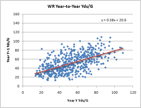
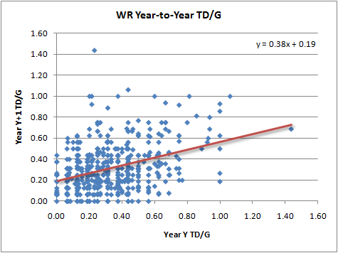
WR fantasy performance is far simpler than QB fantasy performance. Receiving yards and touchdowns are the only driving factors. Rushing or kick returning yards are ignored in these WR projections. Receiving yards and TDs appear to regress at similar rates from year to year, so these projected rankings will likely be a straight regurgitation of last year's end-of-year rankings.

I included WRs with at least 20 receptions in a season in the analysis. Depending on how high the cutoff, or which stat you use (yards, games, receptions), the regression rate is different. In the end however, the overall rankings aren't significantly affected, and the projected points are only slightly different.


Wide Receivers don't appear to have any consistency in terms of fumbles or injuries. They average 0.05 fumbles per game, with guys who get a lot of receptions obviously having more opportunities. WRs play in an average of 14.3 games in a season regardless of how many they played the year before.

I've removed Burress and Harrison, but I didn't spend much time looking through the list to find guys who may have retired or who may already be on the IR.


RankNameTDsYdsFumPts/GProj Pts
1Anquan Boldin 0.5471.10.076.695.0
2Larry Fitzgerald 0.4772.80.056.491.3
3Calvin Johnson 0.4769.20.066.288.5
4Andre Johnson 0.3878.10.056.187.0
5Steve Smith CAR0.3579.90.056.085.6
6Greg Jennings 0.4067.80.055.781.7
7Roddy White 0.3671.10.055.680.0
8Randy Moss 0.4557.40.065.578.1
9Brandon Marshall 0.3469.80.065.477.5
10Terrell Owens 0.4359.00.055.477.4
11Antonio Bryant 0.3666.20.055.376.5
12Lance Moore 0.4354.50.055.274.3
13Marques Colston 0.3661.00.055.173.3
14Vincent Jackson 0.3660.70.055.172.6
15Reggie Wayne 0.3362.40.055.071.9
16Hines Ward 0.3658.70.055.071.1
17Dwayne Bowe 0.3657.90.054.970.7
18Kevin Walter 0.3853.40.054.969.5
19Bernard Berrian 0.3655.80.054.869.2
20Santana Moss 0.3358.70.054.869.2
21Justin Gage 0.3852.30.054.868.7
22Eddie Royal 0.3258.70.054.767.8
23Deion Branch 0.3850.70.054.767.5
24Derrick Mason 0.3158.50.054.766.8
25Donald Driver 0.3157.60.054.666.4
26Wes Welker 0.2663.10.054.666.2
27Laveranues Coles 0.3651.60.054.666.1
28Isaac Bruce 0.3651.10.054.665.8
29Muhsin Muhammad 0.3154.30.054.563.9
30T.J. Houshmandzadeh 0.2955.80.054.563.7
31Santonio Holmes 0.3252.60.054.463.3
32Lee Evans 0.2657.80.054.462.3
33Steve Breaston 0.2657.30.054.462.2
34Jerricho Cotchery 0.3151.90.054.362.1
35Matt Jones 0.2557.60.054.361.6
36Greg Camarillo 0.2653.10.054.159.0
37Braylon Edwards 0.2652.50.054.158.8
38DeSean Jackson 0.2453.90.054.057.6
39Chad Ochocinco 0.3144.80.054.057.2
40Torry Holt 0.2649.70.054.056.7
41Devery Henderson 0.2649.60.054.056.5
42Michael Jenkins 0.2649.00.053.956.2
43Anthony Gonzalez 0.2944.80.053.955.3
44Chris Chambers 0.3339.90.053.955.2
45Kevin Curtis 0.2845.90.053.955.2
46Donnie Avery 0.2746.80.053.955.1
47Malcom Floyd 0.3141.50.053.854.8
48Devin Hester 0.2746.50.053.854.7
49Ted Ginn Jr. 0.2449.50.063.854.2
50Mark Clayton 0.2646.00.053.854.1
51Antwaan Randle El 0.2942.30.053.753.5
52Amani Toomer 0.2941.80.053.753.0
53Nate Washington 0.2643.60.053.752.4
54Patrick Crayton 0.2940.70.053.752.2
55Josh Reed 0.2247.40.053.651.6
56Mark Bradley 0.2939.10.053.651.2
57Brandon Stokley 0.2741.20.053.651.1
58Dennis Northcutt 0.2543.30.053.550.6
59Bobby Wade 0.2444.10.053.550.5
60Bryant Johnson 0.2640.50.053.550.2
61Jerheme Urban 0.2937.00.053.549.7
62Brandon Lloyd 0.2639.90.053.549.6
63Domenik Hixon 0.2442.40.053.549.5
64Koren Robinson 0.2540.10.053.449.2
65Josh Morgan 0.2936.10.053.449.1
66Ike Hilliard 0.2936.10.053.448.9
67Hank Baskett 0.2737.70.053.448.5
68Roy Williams 0.2737.40.053.448.3
69Johnnie Lee Higgins 0.2934.00.053.347.5
70Steve Smith NYG0.2241.30.053.347.0
71Davone Bess 0.2240.80.053.246.4
72Chansi Stuckey 0.2734.60.053.246.3
73Jabar Gaffney 0.2437.70.053.246.2
74Rashied Davis 0.2436.80.053.245.5
75Reggie Williams 0.2633.90.053.245.5
76Bobby Engram 0.1942.60.053.245.5
77Michael Clayton 0.2239.50.053.245.4
78Jason Avant 0.2435.30.053.144.7
79Arnaz Battle 0.1941.20.053.144.6
80James Jones 0.2336.60.053.144.6
81Shaun McDonald 0.2236.80.063.143.8
82Brandon Jones 0.2237.00.053.143.7
83Jordy Nelson 0.2434.00.053.043.5
84Dane Looker 0.2532.70.063.043.3
85Jason Hill 0.2432.20.052.942.1
86Justin McCareins 0.1937.80.062.941.9
87Harry Douglas 0.2232.30.052.840.3
88Roscoe Parrish 0.2231.00.052.839.8
89Antonio Chatman 0.1931.90.052.637.8
90Brian Finneran 0.2226.80.052.536.2

Comparing Running Performance

This post follows a discussion of how to rate running back performance (or team rushing performance) that began at PFR and continued at Smart Football. I'll add my two cents here.

Yards per carry (YPC) is a useful stat, but it doesn't tell us everything we want to know. Median yards gained isn't very useful because, with rare exceptions, every RB will have a median gain of 3 yds. There are any number of suggestions for alternate measures such as yards above team median, yards above replacement, or success rate (the Hidden Game of Football system used by Football Outsiders). The comments at the Smart Football post feature a great discussion of the topic. Unfortunately, there really is no single number that can capture the full picture. In fact, what we really need is a picture.

I'll explain that in a minute, but first I want to address an age-old water cooler question that Chris discussed in his post at Smart Football. Consider two RBs, both with identical YPC averages. One however, is a boom and bust guy like Barry Sanders, and the other is a steady plodder like Jerome Bettis. Which kind of RB would you rather have on your team?

The answer is it depends. Essentially, we have a choice between a high-variance RB and a low-variance RB. When a team is an underdog, it wants high-variance intermediate outcomes to maximize its chances of winning. And when a team is a favorite, it wants low-variance outcomes. Whether those outcomes occur through play selection, through 4th down doctrine, or through RB style isn't important. If you're an otherwise below-average team, you'd want the boom and bust style RB. If you're an otherwise above-average team, you'd want the steady plodder.

The same concept applies within a game. If you're losing during a game, you have become the underdog no matter how strong your team seemed on paper before kickoff. In this case, you want to increase the risk-reward balance with high-variance plays. You'd accept the risk of a 10-yd loss in the backfield for the possibility of breaking a 40-yd run. But if your team is up by a TD, the 10-yd loss isn't so acceptable.

Further, even if the high-variance RB has a lower average YPC, we'd still might want him carrying the ball when we're losing. This is due to the math involved in competing probability distributions.

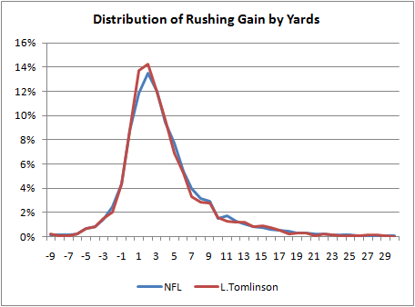
Now back to the question on how to evaluate a RB or team rushing game. Mean, median, or even mode are handy ways of describing a central tendency. But on their own, they don't paint the whole picture. It's a bit like the proverb about several blind men each grasping a part of an elephant. We could say that LaDainian Tomlinson's 4.4 career YPC figure is good because it's above average, but it doesn't tell us much more than that. It's like grasping the elephant's trunk. Instead, we can look at the whole elephant.

Below is the distribution of Tomlinson's career gains. The horizontal axis are the gains, and the vertical axis represents how often he got each gain. The blue line is distribution for the NFL as a whole, and the red line is Tomlison's distribution.


We could simplify the distribution into large bins selected for certain signifcance. For example, we could divide the distribution into all losses, gains of 1-4 yds, 5-10 yds, and 10 yds or more. Tomlinson might be a "10/45/35/10." This is unwieldy, but it's not much different than how the baseball guys use a similar shorthand for wOBA, BAPIP, and the other stats they often bundle together.

Not that I'd ever expect anyone to use this, but we could use a more technical shorthand. The RB gain distributions can be modeled as a gamma distribution, a bell-type curve described by 2 parameters--k and theta. For example, Tomlinson is a Gamma(11, 1.1). That's about all we'd need to know to reproduce his gain distribution. The parameters are not intuitive at all, so it's not a workable solution. (Perhaps someone out there might suggest a better type of distribution to use.)

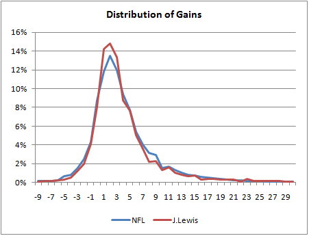
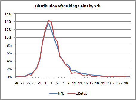
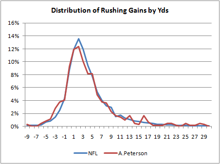
To be honest, I was expecting a bigger difference between Tomlinson and the rest of the league. So I looked at some other RB's distributions. I wanted to see a difference between boom-and-bust guys and plodder-types. I picked Adrian Peterson and Brian Westbrook to compare to Jerome Bettis and Jamal Lewis. Their distributions are plotted below.


What amazes me is how similar they all are to each other and to the league average. One notable exception is Jamal Lewis' peak. He has significantly more runs of between 0 and 3 yards than other backs. If you read the plot the wrong way, this might appear good, but it's defninitely not. Usually, a RB needs 4 to 5 yards to just break even in terms of his team's probability of converting a first down. What we'd want to see on a RB's distribution is as much probability mass as possible to the right of 4 yards.

So if Bettis' distribution looks so much like Tomlinson's, how does Bettis have a 3.9 career YPC and Tomlinson have a 4.4 career YPC? As others have noted previously, the difference among RB YPC numbers primarily come from big runs. It's the open field breakaway ability that separates the guys with big YPC stats from the other RBs. Of Tomlinson's runs, 1.5% were for 30 yards or more. Bettis' 30+ yd gains comprised only 0.46% of his carries. The other RBs and the league average are as follows:

NFL 0.91%
Lewis 0.88%
Westbrook 0.93%
Peterson 2.20%

Adrian Peterson's 2.2% figure is exceptional. It's interesting because it really suggests that what separates Peterson as a great runner is based on only 2% or so of his runs. Otherwise, he's practically average.

Of course, the usual caveats apply. When talking about a specific RB, we are really talking about his team's running performance when the RB has the ball. And we haven't considered game situation yet. Ideally, we'd want to plot a series of distributions, one for each typical down and distance situation--1st and 10, 2nd and long, 2nd and mid/short, and 3rd and short. But that's a far cry from a nice handy single number.

Koko The Fantasy Football Monkey

It’s that time of year when morons all over the country (like me) start to put their cheat sheets together for another season of fantasy football. I’ve resisted doing a lot of fantasy stuff on this site despite the obvious overlap between real stats and fantasy stats. I did some stuff last year on drafting strategies, but this year I’m going to break down and produce my own player rankings, but with a twist.

I’m going to make dumb rankings, in fact, as dumb as I could possibly make them. My fantasy projections are going to represent what someone would do without any knowledge of football at all. And you know what? I think there’s a good chance they’re going to end up no worse than any other ranking by the 'experts' or sophisticated ranking systems out there. I have a hunch that fantasy football is about 99% luck.

In a 10-team league, you’d ordinarily expect a 10% chance of winning. But what if you optimized your draft perfectly, read every fantasy site out there, and hawked the waiver wire every week. How high could you get your chances of winning your league? 13%? 15%? You’d need to play in literally dozens of seasons of fantasy football to really know if you’re any good or just lucky.

After last season I was struck by an analysis of the accuracy of some of the more prominent expert projections. Accuracy scores were listed for each system by position. I noticed how none of the systems were consistently near the top. One system could be #1 for QBs, but near the bottom for RBs and WRs. And no system was consistent from year to year either. If a system were any good, wouldn’t it work well in more than just one year or for more than one position? What this tells me is that no one really knows what they’re doing. They’re guessing like everyone else.

Here’s how I’m going to do my projections: I’ll take each component of a position’s fantasy score total and regress each component separately. Then make an estimate for each stat based on the regressions, add up the points, and that’s the final projection. For example, QB TD passes are less consistent from year to year than passing yards, so each component would have a different rate of regression. I’ll walk you through the QB rankings later in this post, and other positions will follow.

Blatant Rip-Off

Some of you may think that this is a blatant rip-off of baseball analyst Tom Tango’s ‘Marcel’ projections for MLB players. You’re completely right. Full credit hereby goes to him. Tango regresses hitter and pitcher stats over the last several seasons and adjusts for age. His system is completely unaware of trades, injuries, or ‘intangibles.’ It turns out Marcel is nearly as accurate as the proprietary high-power projection systems out there, some of which charge subscription fees.

These projection systems all seem to need names like CHONE or PECOTA for some reason. Marcel gets its name from the pet monkey on the sitcom Friends because the projections are what a monkey would project (a monkey that knows regression, I suppose.) But I was always more of a Seinfeld guy, so I’m leaning toward Koko:


QB Projections

I’ll walk through the QB projections. Nothing here is any more complicated than what anyone can do with an internet connection, Excel, and 30 minutes. I’m only looking at QBs who had over 200 pass attempts in a season. And after all, in fantasy we’re only interested in the top guys.

Baseball projection systems usually look back three or more years and weight recent years more heavily. But for football, I’m going to just go back one year for a couple reasons. First, using only one year is really simple and easy, and monkeys like simple and easy. Plus, in contrast to baseball, player performance is heavily dependent on the rest of the team. Teammates come and go all the time, either due to free agency, retirement, draft, or injury. It’s likely better to keep those changes to a minimum by only looking at the most similar year in terms of teammates. So I’m going to stick with one year. (And actually, going back more than one year provides almost no added predictive power based on the r-squared of the regression.)

I won’t make any age adjustments either. Going back just one year means that a player will now only be one year older than his baseline, so the effect should be minimal. I think the only glaring shortcoming with this method may be second-year starting QBs, who tend to make significant improvements. But in a way, a simple regression will adjust for some of the effect of age. Older, better players will tend to decline, regressing to the league average, while younger rookies, who often have rough first years, will tend regress up toward the league average.

For guys like Tom Brady or Carson Palmer, who missed an entire or nearly an entire season due to injury, I regress them twice--once for their estimated performance for the missing year and again for the current year projection. This might a little too pessimistic for a guy like Brady, but the method is logical and consistent.

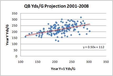
Let’s start with passing yards. Normally, I don’t rely on total yardage when ranking players or teams, but that’s all that matters for fantasy. So I’ll look at total passing yards per game. Using data from 2001 through 2008, I plotted each qualifying QB’s Yds/G from a previous year with his Yds/G from the subsequent year (below). I’ll use the resulting trend line to estimate next year’s Yds/G based on last year’s.


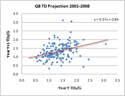
Next, let’s look at TD passes per game. The slope is shallower, and the dispersion of the data is wider. This means TDs/G are not as consistent as Yds/G. A QB who last year led the league in fantasy points based on lots of TD passes will probably not be so hot this year.


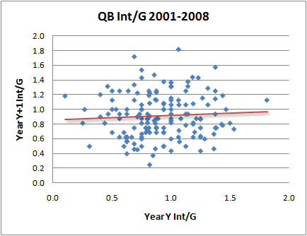
Interceptions are even less consistent. Interceptions per game appear almost completely unrelated to those of the previous year. You might be able to get a better projection with a complex formula of interceptions per attempt and yards per attempt, but monkeys don’t want to think that hard. I’m tempted to just assign the average Ints/G to every QB. But I’ll project them according to the trend line, even if it’s almost certainly not statistically significant.


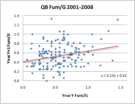
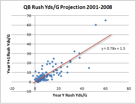
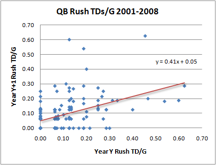
Fantasy points for QBs also come from sacks, fumbles, rushing yards and rushing TDs. The plots for year-to-year projections for each of those stats are below.


Adding up all the projections based on prior year per-game stats, we can get a reasonable fantasy point total for each QB. Top qualifying QBs play an average of 13.6 games the following year, so I’ll multiple the per game stats by 13.6 for a grand total. The table below is based on a scoring system of 6 points for every TD, 1 point for every 50 pass yards, 1 point for every 20 rush yards, -2 points for every turnover, and -1 point for every sack.

What about rookies or other players not ranked? I don’t know. I’ll just throw anyone else as tied for last. If you’re picking QBs that deep into your fantasy draft, maybe you need a smaller league.

Would I use these projections in my own league? Probably not. But these projections should serve as the bare minimum level of predictive power. If a system does any worse, it’s either really bad or really unlucky. After the season it will be fun to come back and see if these rankings were any good. At the very least, we learned something about the year-to-year consistency of a QB's performance.


PlayerPass YdsTDsIntsSacksFumRushPts/GProj Pts
Drew Brees 2781.71.01.10.51.312.3167
Tony Romo 2511.71.01.60.63.811.5156
Peyton Manning 2421.60.91.20.42.311.2152
Kurt Warner 2581.60.91.60.61.211.0149
Jay Cutler 2511.50.91.20.511.110.8148
Philip Rivers 2321.61.01.60.55.410.6144
Aaron Rodgers 2381.61.22.00.511.410.2139
Tom Brady 2441.6

1.11.50.50.09.8

133
Donovan McNabb 2371.40.92.10.58.59.5130
Shaun Hill 2261.51.22.20.611.39.0123
Carson Palmer 2411.41.21.60.50.09.1123
Matt Schaub 2451.41.01.90.66.18.9121
Eli Manning 2121.40.91.80.51.88.7119
Matt Cassel 2271.41.22.40.514.58.6118
David Garrard 2231.30.92.30.517.08.6116
Derek Anderson 1981.30.81.40.65.68.4114
Kyle Orton 2111.41.11.90.53.88.4114
Chad Pennington 2211.30.92.00.54.38.2111
Sage Rosenfels 2061.41.21.40.50.08.1111
Ben Roethlisberger 2141.50.92.90.66.28.0109
Matt Ryan 2201.31.21.60.56.47.9108
Jake Delhomme 2151.31.21.70.52.37.6103
Jason Campbell 2121.10.82.10.513.97.5102
Joe Flacco 2051.31.22.00.610.17.4101
Trent Edwards 1981.20.91.60.67.87.4100
Matt Hasselbeck 2061.20.92.50.49.07.298
Gus Frerotte 2101.31.22.30.51.87.297
Kerry Collins 1961.21.11.30.53.77.297
JaMarcus Russell 1931.21.12.00.67.96.994
Marc Bulger 2001.10.92.70.53.45.880


Where Does the 'Red Zone' Really Begin?

Back when I studied aerodynamics, the first thing we were taught was that we needed to assume air was an incompressible fluid, otherwise the math just gets too hard. But when my trusty old F/A-18 would approach the sound barrier, the air in front of the plane couldn't get out of the way fast enough, and aerodynamically, things got weird. To model the fluid dynamics of the air flow at these kinds of speeds you need to allow the air to be compressible.

I'm running into this exact same problem now as I am completing a big project on 4th down decisions. The compression of the field toward the end zone means defenses have less area to cover, and it becomes harder for offenses to move the ball. The region where this occurs is, of course, called the red zone. But is the 20-yard line really where the compression effect begins? And how strong is the effect?

We could look at average gain per play based on field position, and we’d see this graph where the decline in average gain begins around the 30 and becomes dramatically steep by the 20.


But this would be misleading because the endzone truncates longer plays. There’s no possibility of a 30-yd gain from the 20-yd line, but there is from the 30, the 40, and so on. So let’s look at it another way.

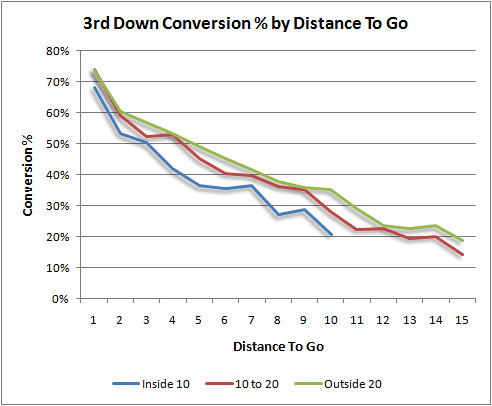
This graph plots the 3rd down conversion percentage by distance to go for three regions of the field: inside the 10, from the 10 to the 20, and outside the 20.


It looks like the 10 to 20 region is very similar to the rest of the field, but the Inside 10 region is where it’s noticeably tougher to convert. But even there the difference is relatively small.

These results could be interpreted another way. If the compression effect occurs at 3rd and 6 on the 15 yd line, then that series began at the 21. Therefore, we might as well say that the effect began, for practical purposes, at the 21.
There are any number of ways to look at this, but this way happens to be what I need for the larger 4th down project.

Thanks for the Memories, Brett

With Brett Favre’s recent non-un-retirement making news, I thought I’d take a look back at some of his best plays. I know I’ve been critical of Favre during his comeback year, but to be honest, I truly respect his play. How could you not? What I really didn't like was the fawning media, which overlooked every indication he was nothing close to his old self. Still, the bottom line is that he was a great competitor and most of all a winner.

And what better way to measure a winner than to directly measure his contribution to his team’s chances of winning with a stat like win probability (WP)? Every play in a game has an effect on the WP, whether it’s +1% or -20%. We can sum up the WP for all the plays a player has been a part of, and we can get some idea of his overall contribution to his team’s efforts. For a specific play, or for a specific player, this is ‘win probability added’ (WPA).

I’ll use WPA to go back through the database and pull out Favre’s most heroic plays. Unfortunately, the data only go back through 2000, after some of Favre’s peak years. But it is still a neat way to demonstrate some of the interesting things we can do with WPA, and it hints at some of its future applications in football.

The table below lists Favre’s twelve plays with the biggest impacts.

Favre's Best Plays of the Decade


DateWPAOppDn-Dist-Fld PosLeadW/LQtrPlay Description
10/29/20070.55DEN1-10 OWN 180WOT(14:56) 4-B.Favre pass deep left to 85-G.Jennings for 82 yards TOUCHDOWN.
9/23/20070.53SD2-10 OWN 43-4W4(2:13) (Shotgun) 4-B.Favre pass short left to 85-G.Jennings for 57 yards TOUCHDOWN.
10/7/20010.49TB2-3 TB 38-4L4(1:19) (Shotgun) 4-B.Favre pass to 30-A.Green to TB 13 for 25 yards (59-J.Duncan). screen right
12/8/20020.34MIN3-13 MIN 40-9W4(10:58) (Shotgun) 4-B.Favre pass to 89-R.Ferguson for 40 yards TOUCHDOWN.
11/14/20040.33MIN2-10 OWN 460W4(1:05) 4-B.Favre pass to 40-T.Fisher to MIN 29 for 25 yards (21-C.Chavous).
10/17/20040.32MIN3-10 OWN 16-7L4(12:07) (Shotgun) 4-B.Favre pass to 80-D.Driver for 84 yards TOUCHDOWN.
11/4/20070.31KC2-10 OWN 40-6W4(3:13) (Shotgun) 4-B.Favre pass deep middle to 85-G.Jennings for 60 yards TOUCHDOWN.
11/6/20000.31MIN3-4 MIN 430WOT(11:33) B.Favre pass to A.Freeman for 43 yards TOUCHDOWN. Play Challenged by Review Assistant and Upheld.
10/26/20080.30KC2-5 KC 15-3W4(1:05) (Shotgun) 4-B.Favre pass short left to 87-L.Coles for 15 yards TOUCHDOWN.
12/21/20060.30MIN2-6 OWN 37-1W4(4:05) 4-B.Favre pass deep right to 82-R.Martin to MIN 27 for 36 yards (26-A.Winfield).
12/10/20000.28DET3-8 DET 492W4(5:50) B.Favre pass to B.Schroeder pushed ob at DET 4 for 45 yards (J.Brown).
1/11/20040.26PHI1-10 OWN 490L4(12:22) 4-B.Favre pass to 84-J.Walker to PHI 7 for 44 yards (21-B.Taylor).


What stands out to me is that 6 of the top 10 plays were against his almost-current team, the Minnesota Vikings. Also, not all of them were touchdown plays. Many were simply critical first down plays late in tight games. I remember the #1 play well because 2007 was when Favre was my fantasy QB, and that game against the Broncos was a nationally televised game.

Of course, there were receivers and blockers making the plays too. I can’t separate the individual contributions to each play. Still, the list is a handy way to start looking for great plays.

I know what all the Favre critics are wondering, and I was wondering the same thing. I couldn’t help it. Below are his twelve worst plays. The same caveat applies—the bust could be on a receiver or blocker, and not Favre himself. And let’s not forget that the other team gets paid too.


Favre's Worst Plays of the Decade


DateWPAOppDn-Dist-Fld PosLeadW/LQtrPlay Description
10/26/2008-0.61KC3-2 KC 84W4(9:29) (Shotgun) 4-B.Favre pass short middle intended for 83-C.Stuckey INTERCEPTED by 24-B.Flowers at KC 9. 24-B.Flowers for 91 yards TOUCHDOWN.
10/8/2006-0.54SL2-10 SL 11-3L4(:44) (Shotgun) 4-B.Favre sacked at SL 18 for -7 yards (91-L.Little). FUMBLES (91-L.Little) touched at SL 15 RECOVERED by SL-23-J.Butler at SL 13. 23-J.Butler to SL 13 for no gain (63-S.Wells).
10/7/2001-0.43TB1-6 TB 60L2(15:00) 4-B.Favre pass intended for 88-B.Franks INTERCEPTED by 53-S.Quarles at TB 2. 53-S.Quarles for 98 yards TOUCHDOWN.
12/4/2005-0.41CHI1-7 CHI 71L2(:24) (Shotgun) 4-B.Favre pass intended for 89-R.Ferguson INTERCEPTED by 33-C.Tillman at CHI -2. 33-C.Tillman pushed ob at GB 7 for 95 yards (40-T.Fisher).
12/24/2000-0.41TB2-10 TB 340W4(1:54) B.Favre pass intended for C.Lee INTERCEPTED by J.Duncan at TB 28. J.Duncan to TB 43 for 15 yards (A.Green).
12/21/2006-0.39MIN1-10 OWN 406W3(5:19) (Shotgun) 4-B.Favre pass short left intended for 85-G.Jennings INTERCEPTED by 21-F.Smoot at GB 47. 21-F.Smoot for 47 yards TOUCHDOWN.
1/11/2004-0.38PHI1-11 OWN 320LOT(13:12) 4-B.Favre pass intended for 84-J.Walker INTERCEPTED by 20-B.Dawkins at PHI 31. 20-B.Dawkins to GB 34 for 35 yards (30-A.Green).
11/24/2002-0.38TB1-12 OWN 261L3(7:27) 4-B.Favre pass intended for 83-T.Glenn INTERCEPTED by 25-B.Kelly at GB 49. 25-B.Kelly ran ob at GB 18 for 31 yards (30-A.Green).
12/24/2004-0.37MIN3-4 OWN 70W4(8:31) 4-B.Favre pass intended for 84-J.Walker INTERCEPTED by 55-C.Claiborne at GB 15. 55-C.Claiborne for 15 yards TOUCHDOWN.
9/17/2006-0.36NO1-7 NO 7-1L3(7:57) 4-B.Favre pass short right intended for 33-W.Henderson INTERCEPTED by 23-O.Stoutmire [55-S.Fujita] at NO -1. Touchback.
1/20/2008-0.35NYG2-8 NYG 80LOT

(14:13) 4-B.Favre pass short right intended for 80-D.Driver INTERCEPTED by 23-C.Webster at GB 43. 23-C.Webster to GB 34 for 9 yards (80-D.Driver).
9/9/2007-0.34PHI3-7 PHI 70W4(4:26) 4-B.Favre sacked at GB 43 for -9 yards (58-T.Cole). FUMBLES (58-T.Cole) RECOVERED by PHI-93-J.Kearse at GB 38. 93-J.Kearse to GB 38 for no gain (76-C.Clifton).


WPA takes into account the context within the game, but it does not account for the context around the game. In other words, it treats the overtime interception against the Giants in the NFC Championship game in 2008 the same as if the game were in September. I don't blame him for not wanting that to have been his last play.

Fifth Down Finale

My fifth and final contribution this week to the NY Times Fifth Down Blog is a Q&A with Toni Monkovic. Toni asks me about everything from predictions to win probability to Bill Belichick.

Verducci Follow-Up

The recent post about the Verducci Effect and Let's Make A Deal didn't elicit the response I was looking for. Reactions ranged from denial to sadness to even anger. I think the game show story hurt more than helped my case of why I think the Verducci Effect is an illusion. And as I said in the original article, I'm not completely certain. But now, after developing my thoughts a little better, I'm more certain than before.

Game shows aside, I'll explain my thought process with an notional example, a mental exercise actually. I'm most interested in the injury aspect of the Verducci Effect, so I'll concentrate on that in this post. The injury rates I'm going to use are created only for clarity, and they are not intended to match the true rates. I'm also going to make some simplifying assumptions to illustrate the broader point. Please keep in mind this example is only intended to demonstrate a concept.

The Example

Assume every MLB pitcher's career lasts exactly 5 years. Also assume that the league-wide injury rate is 1 out of 5 years, defined as however you like--say being on the DL. Also assume that one year out of each pitcher's career can be identified, after the fact, as a "career year," which by definition assures us of two things: no significant injury and an upswing of innings.

Take 200 pitchers and randomly assign a number from 1 through 5 to each of their 5 respective years completely independently. When a 1 comes up, call that an injury year. So far, we've got a 1 in 5 (20%) injury rate across the league. Some pitchers will have multiple injury years, some won't have any, and they are completely independent.

In my head I'm thinking of a table of cards, 200 x 5. For now, the cards are turned up so we can see the numbers 1 through 5. 20% of the cards are 1s--injuries.

Now, take all the "career years" for the pitchers off the table by removing one card from each row, which by definition cannot be an injury year. Let's choose the highest card and remove it. What percentage of cards will now be 1s (injuries)? Before, there were 200 out of 1000 (20%), and now there are the same number of injuries (200) but fewer cards remaining (800). 25% of the remaining years are 1s (injuries). If we now selected a card at random, we'd have a 1 in 4 chance at finding an injury.

Shrink the Sample

Let's do the same exercise but with a sub-sample of 50 pitchers instead of 200. There are still 20% injury years, and if we take each pitcher's known "career year" off the table, 25% of the remaining years will be injury years. Turn over the remaining cards, so you can't see the numbers 1-5. Turn one card face up at random--what are the chances of finding a 1-card (an injury)? It has to be 25%. We started with 250 cards, but there are now 200 cards remaining and 50 of them are injury cards.

Shrink It Again

Repeat the exercise with 10 pitchers. Does this change anything? No. Originally 20% of the cards were injuries, and after removing the career year cards, 25% of those remaining are injuries.

Down to One Player

Now consider a sub-sample of just a single pitcher. Again, turn over all the cards so we can't see the numbers 1-5. There are originally 5 cards on the table, with a probability of 1 in 5 being an injury card. Take away one card, which we know after the fact is not an injury card, leaving 4 cards. Turn one card over--the card dealt immediately following the "career" year. What is the chance it's an injury?

It would be 25%. We had a league-wide injury rate of 20%, but following career/high-inning years we would retrospectively observe a rate of 25%. Even though the injuries were distributed completely at random and completely independently, we'd see a false connection between high-inning years and injuries in subsequent years.

Even a small difference would appear statistically significant with a large data set, but it would be an illusion. The original probability of a year being an injury year was always 20%, but after looking back and removing a year in which we're virtually assured of no injury, we'd see a 25% injury rate.

Try It Yourself

If you don't believe me, you can play the game yourself. Shuffle a deck of cards and deal out 4 face up in row. Those 4 cards represent 4 years of a pitcher's career. Every time we see a diamond card, we'll call that an injury year. We'll say the highest non-diamond card is a career/high-inning year. It goes without saying that, on average, 1 in every 4 cards will be a diamond--an injury. That's our true baseline rate.

After dealing the 4 cards, remove the highest non-diamond card and set it aside. Look at the card immediately to the right of the one you removed. What is the probability it is a diamond? If you said 1 in 4 you'd be mistaken. It's 1 in 3. This is the same illusion.

Try it. I did, 78 times and got a diamond on 26 tries--exactly one third (p=0.04 for the sticklers out there). You have to re-shuffle each time for it to be completely random and independent. Also, if the high "career" card is the right-most card, you can either throw out that iteration or loop around to look at the first card. The effect is the same. In fact, just look at how many of the 3 remaining cards are diamonds, and you'll eventually see that it's 1 in 3.

I'm sure there is a name for this, but I don't know it. If anyone is familiar, fill me in. Otherwise, I'm sticking with the Monty Hall Effect. Also, the Verducci Effect may still be real, but it would have to be shown that the observed injury rates significantly exceed the rate predicted by the effect of the illusion.

Maybe I'm wrong, and that's ok. But every time I deal 4 cards and remove 1 non-diamond, I keep seeing diamonds 33% of the time. Just like the Monty Hall game, you probably won't believe it until you try it yourself.

[Edit: I am now completely certain the paradox/illusion exists as I described. However, after a good discussion with commenter Vince (see below), I'm no longer convinced that the way I set up the question applies to how the Verducci Effect is truly applied. In other words, the illusion is real if you set it up the way I did. It's just that strange, and subtle differences exist in how you look at the problem. For example, if in the pitcher example, you removed the first instance of a non-1, you would see a 1 in the following block 20% of the time, just like you'd expect. But if you select the highest number in the row, or if you remove the final non-1, you'd detect a 1 next 25% of the time.]